
Illustrative Example
Suppose we have a series of data obtained from an experiment that measure position (x) versus time (t) of a particle that moves with constant velocity. The data can be stored in a file named result.dat and saved in the same folder of your main project.
t	      x
0	      1
1.2	    1.78
2.3	    4.495
3.4	    5.21
4.1	    4.665
5.6	    5.64
6.5	    7.225
7.2	    7.68
8.1	    6.265
9.3	    8.045
10.7	  8.955
Plot data from a file in LaTeX
To plot this data in LaTeX, we can use the \addplot command along with the table option and specify the name of the columns we want to plot, like follows:
 \documentclass{standalone}

% Required package
\usepackage{pgfplots}
\usepackage{pgfplotstable}
\pgfplotsset{compat = newest}

\begin{document}

\begin{tikzpicture}

\begin{axis}[
	xmin = 0, xmax = 11,
	ymin = 0, ymax = 11,
	width = \textwidth,
	height = 0.75\textwidth,
	xtick distance = 1,
	ytick distance = 1,
	grid = both,
	minor tick num = 1,
	major grid style = {lightgray},
	minor grid style = {lightgray!25},
]
% plot data line code
\addplot[teal, only marks] table[x = t, y = x] {result.dat};

\end{axis}

\end{tikzpicture}

\end{document}
Compiling the above code yields:

Plot data in LaTeX using Pgfplots package
Notice that in the preamble we have included the pgfplotstable package. This package allows us to use the table command, and more important, it will help us to compute the linear regression for our data. In the previous code, we have also included some extra options in the axis environment that changes the style of the grid, the limits of the plots. Also notice that in the \addplot command we have included the only marks options to get a scatter plot. For more details, I invite you to read this post about plotting functions and data in LaTeX.
Compute and Plot Linear Regression in LaTeX
Now here comes the interesting part. Usually to plot a linear regression we use third party software like Excel. But with the pgfplotstable package we can compute the linear fitting inside the LaTeX document. We just need to add the next sentence to the code:
\addplot[options] table[
x = column_name,
y = {create col/linear regression = {y = column_name}}
] {data_file_name.dat};
Here we specify the name of the column in the x axis, in our case it should be t, and for the values for the y axis we pass the command create col/linear regression, which computes a linear regression for the data_file_name.dat.
The next code shows how to implement the code to plot the line that better fits the whole scatter data:
\documentclass{standalone}
% Required package
\usepackage{pgfplots}
\usepackage{pgfplotstable}
\pgfplotsset{compat = newest}
\begin{document}
\begin{tikzpicture}
\begin{axis}[
xmin = 0, xmax = 11,
ymin = 0, ymax = 11,
width = \textwidth,
height = 0.75\textwidth,
xtick distance = 1,
ytick distance = 1,
grid = both,
minor tick num = 1,
major grid style = {lightgray},
minor grid style = {lightgray!25},
xlabel = {Time ($t$)},
ylabel = {Position ($x$)},
legend cell align = {left},
legend pos = north west
]
% Plot data
\addplot[
teal,
only marks
] table[x = t, y = x] {result.dat};
% Linear regression
\addplot[
thick,
orange
] table[
x = t,
y = {create col/linear regression={y=x}}
] {result.dat};
% Add legend
\addlegendentry{Data}
\addlegendentry{
Linear regression: $ x =
\pgfmathprintnumber{\pgfplotstableregressiona}
\cdot t
\pgfmathprintnumber[print sign]{\pgfplotstableregressionb}$
};
\end{axis}
\end{tikzpicture}
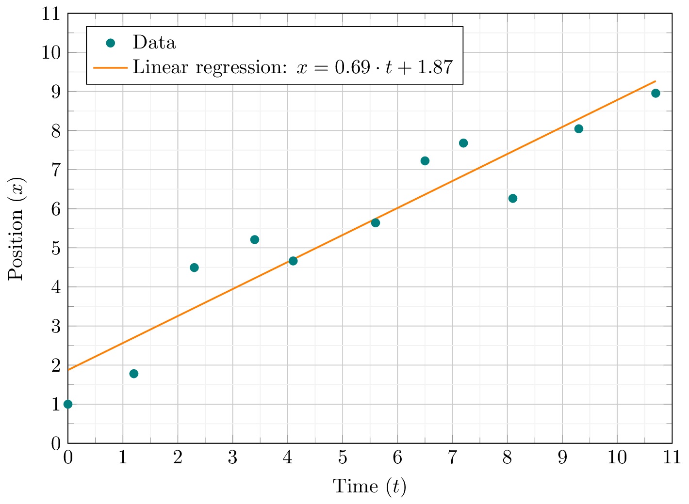
\end{document} Compute and plot Linear regression in LaTeX
Comments:
Now we can see the trend line plotted. But that's not the most important feature of the pgfplotstable package. In this situations it's not only important to plot the trend line, but also to find its equation.
It's well known that the equation of a linear regression looks like:

Now we need to compute the constants a and b. The slope parameter a can be computed using the following command:
\pgfmathprintnumber{\pgfplotstableregressiona}
And to compute b we use:
\pgfmathprintnumber[print sign]{\pgfplotstableregressionb}
The \pgfplotstableregressiona and \pgfplotstableregressionb commands returns the values for the constants a and b respectively.
For our illustrative example, we got:

Which represents the movement equation of the particle.
In the data file, the first line should “r” and “t”. Then, the scripts runs like a clock.
Many thanks Walson for your feedback, I really appreciate it ????!
Yes, we can change the data file or simply change the \addplot options. We specify the first line labels of the data file: table[x = t, y = x] instead of table[x = t, y = r].
Thanks again for you remark!