Plotting functions and data in LaTeX is quiet easy and this is possible thanks to the TikZ and Pgfplots packages. In this tutorial, we will learn how to plot functions from a mathematical expression or from a given data. Moreover, we will learn how to create axes, add labels and legend and change the graph style.
Let us consider the following function:

where we would like to get something similar to the next figure together with a data plotted from a given file.

Plotting function and data in LaTeX using Pgfplots package
Let's start by setting up the tikzpicture environment.
Create a TikZpicture environment
First of all, we need to set up the project by loading the Pgfplots package in the preamble. It should be noted that when you write \usepackage{pgfplots} some code in the pgfplots loads the TikZ package.
\documentclass{standalone}

\usepackage{pgfplots}

\pgfplotsset{compat = newest}

\begin{document}

\begin{tikzpicture}
	\begin{axis}[]
		% here comes the code
	\end{axis}
\end{tikzpicture}

\end{document}
Compiling the above code yields to the following illustration:

It is important to use the command \pgfplotsset{compat = newest} to specify to the compiler that we are working with the last version of the Pgfplots package.
In order to start plot functions and data in TikZ we need to create the axis environment within the tikzpicture environment. All the pgfplots commands must be inside the axis environment.
Plot a function in LaTeX
To plot a function, we just need to use the command \addplot[options]{ewpression}. Check the following code to figure out how this command should be used for the above function.
\documentclass{standalone}

\usepackage{pgfplots}

\pgfplotsset{compat = newest}

\begin{document}

\begin{tikzpicture}
	\begin{axis}[]
		\addplot[] {exp(-x/10)*( cos(deg(x)) + sin(deg(x))/10 )};
	\end{axis}
\end{tikzpicture}

\end{document}
Compiling the above code yields:

Plotting a function with default parameters
The domain and range of the plot is auto determinate by the compiler. So if we want to change the limits of the plot we need to specify it manually in the axis environment. For this purpose we can use these options:
For this example let be xmin=0.0, xmax=30, ymin=-1.5 and ymax=2.0. Of course you can change these values depending on the domain and range of the function. Here is a modified version of the above code:
\documentclass{standalone}

\usepackage{pgfplots}

\pgfplotsset{compat = newest}

\begin{document}

\begin{tikzpicture}

\begin{axis}[
	xmin = 0, xmax = 30,
	ymin = -1.5, ymax = 2.0]
	\addplot[
		domain = 0:30,
	] {exp(-x/10)*( cos(deg(x)) + sin(deg(x))/10 )};
\end{axis}

\end{tikzpicture}

\end{document}

Plotting a function with customized axes
Don't forget to specify the domain of the function with the option domain = a:b. In this case we set this parameter to domain = 0:30. The domain of the function is independent of the limits of the axes, but usually it takes the same values to get a plot that fills the axis.
How to make the plot smooth in LaTeX
The previous figure has a rough plot and to get a smooth one, we can use the following options:
The obtained illustration is shown below (smooth plot). We have changed the stroke and color of the function by providing the options thick and blue to the \addplot command. You can try different strokes: ultra thin, very thin, thin, semithick, thick, very thick, ultra thick and line width=<value>.

Line width options
\documentclass{standalone}

\usepackage{pgfplots}

\pgfplotsset{compat = newest}

\begin{document}

\begin{tikzpicture}

\begin{axis}[
	xmin = 0, xmax = 30,
	ymin = -1.5, ymax = 2.0]
	\addplot[
		domain = 0:30,
		samples = 200,
		smooth,
		thick,
		blue,
	] {exp(-x/10)*( cos(deg(x)) + sin(deg(x))/10 )};
\end{axis}

\end{tikzpicture}

\end{document}
Compiling this code yields:

Smooth plot
How to change figure size in LaTeX
The next step is to set up the grid and the aspect ratio of the figure. This can be achieved by using these options:
Here is a piece of code that uses the above parameters:
\documentclass{standalone}

\usepackage{pgfplots}

\pgfplotsset{compat = newest}

\begin{document}

\begin{tikzpicture}

\begin{axis}[
	xmin = 0, xmax = 30,
	ymin = -1.5, ymax = 2.0,
	xtick distance = 2.5,
	ytick distance = 0.5,
	grid = both,
	minor tick num = 1,
	major grid style = {lightgray},
	minor grid style = {lightgray!25},
	width = \textwidth,
	height = 0.5\textwidth]
	\addplot[
		domain = 0:30,
		samples = 200,
		smooth,
		thick,
		blue,
	] {exp(-x/10)*( cos(deg(x)) + sin(deg(x))/10 )};
\end{axis}

\end{tikzpicture}

\end{document}

Change the figure size in Pgfplots to fit text width of the document.
How to plot data from a file in LaTeX
Now suppose you don’t have the expression of the function you want to plot, but instead you have a file, for example cosine.dat with the coordinates as shown below. Here we use a space as separator of the coordinates, but also you can use a comma, only specifies the separator using the option col sep = comma in the \addplot command.
x y
0.0 1.0000
0.5 0.8776
1.0 0.5403
1.5 0.0707
2.0 -0.4161
2.5 -0.8011
3.0 -0.9900
3.5 -0.9365
4.0 -0.6536
4.5 -0.2108
5.0 0.2837
5.5 0.7087
6.0 0.9602
6.5 0.9766
7.0 0.7539
7.5 0.3466
... % data file
Plotting a data files is very similar to plot a mathematical expression, we use again the \addplot command but in slightly different way:
\addplot[options] file[options] {file_name.dat}
The next code shows the implementation of this sentence for plot the previous data file:
\documentclass{standalone}

\usepackage{pgfplots}

\pgfplotsset{compat = newest}

\begin{document}

\begin{tikzpicture}

\begin{axis}[
	xmin = 0, xmax = 30,
	ymin = -1.5, ymax = 2.0,
	xtick distance = 2.5,
	ytick distance = 0.5,
	grid = both,
	minor tick num = 1,
	major grid style = {lightgray},
	minor grid style = {lightgray!25},
	width = \textwidth,
	height = 0.5\textwidth,
	xlabel = {$x$},
	ylabel = {$y$},]

% Plot a function
\addplot[
	domain = 0:30,
	samples = 200,
	smooth,
	thick,
	blue,
] {exp(-x/10)*( cos(deg(x)) + sin(deg(x))/10 )};

% Plot data from a file
\addplot[
	smooth,
	thin,
	red,
	dashed
] file[skip first] {cosine.dat};

\end{axis}

\end{tikzpicture}

\end{document}

Plot data from an external file
Now we have the file plotted, which in this case represents the cosine function, but you can plot any set of coordinates. In options, we have added dashed style for the curve and we have painted it with red color. Also notice that we have used the option skip first since the data file has labels instead of numbers in their first line.
We are almost done, we just need to add a legend to the graphic. This can be done simply by adding the following line code:
\legend{Plot from expression, Plot from file}
after the last \addplot line code. By doing so, we will get the figure in question.
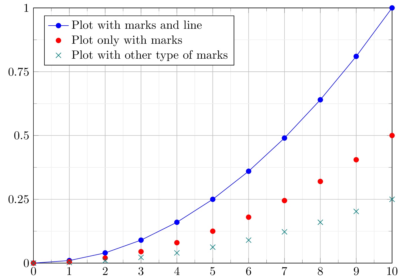
Plot data from a multicolumn file in LaTeX
Now suppose you want to plot a data file with several columns, for example these file named multiple_functions.dat, which have multiple columns.
x	        y1	        y2	        y3
0.0     0.0000	    0.0000	    0.0000
1.0     0.0100	    0.0050	    0.0025
2.0     0.0400	    0.0200	    0.0100
3.0     0.0900	    0.0450	    0.0225
4.0     0.1600	    0.0800	    0.0400
5.0     0.2500	    0.1250	    0.0625
6.0     0.3600	    0.1800	    0.0900
7.0     0.4900	    0.2450	    0.1225
8.0     0.6400	    0.3200	    0.1600
9.0     0.8100	    0.4050	    0.2025
10.0	   1.0000	    0.5000	    0.2500 % data file
In this data file we can see four columns, the first one is the coordinates of the x-axis and the other three columns corresponds to the y-axis values for each x-value. It means we need to plot three functions from a single data file.
This can be achieved easily by using the command:
\pgfplotstableread{file.dat}{\table}
This command reads a file and saves it as a table where you can access the columns once by once.
The next code shows the implementation of the \pgfplotstableread command in order to plot the data file:
\documentclass{standalone}

\usepackage{pgfplots}

\pgfplotsset{compat = newest}

\begin{document}

\pgfplotstableread{multiple_functions.dat}{\table}

\begin{tikzpicture}
\begin{axis}[
	xmin = 0, xmax = 10,
	ymin = 0, ymax = 1,
	xtick distance = 1,
	ytick distance = 0.25,
	grid = both,
	minor tick num = 1,
	major grid style = {lightgray},
	minor grid style = {lightgray!25},
	width = \textwidth,
	height = 0.75\textwidth,
	legend cell align = {left},
	legend pos = north west
]

\addplot[blue, mark = *] table [x = {x}, y = {y1}] {\table};

\addplot[red, only marks] table [x ={x}, y = {y2}] {\table};

\addplot[teal, only marks, mark = x, mark size = 3pt] table [x = {x}, y = {y3}] {\table};

\legend{
	Plot with marks and line,
	Plot only with marks,
	Plot with other type of marks
}

\end{axis}

\end{tikzpicture}

\end{document}
Compiling the code yields:

Plot data from multicolumn file in LaTeX using Pgfplots package
To plot a specific column from a data file, we can use \addplot along with the \table command, as follows:
\addplot[options] table [x = {column_x}, y = {column_y}] {\table};
With the table option you can specify the name of the column you want to be in the x-axis and the name of the column you want to be in the y-axis.
To get different plot style, one with marks and lines, and two only with marks, we used the following options:
This can be useful when you have to plot several graphics on the same figure.
With the method described in this tutorial, you are able to draw any explicit functional equation or any set of coordinates. The Pgfplots package allows to plot any number of functions in the same figure. Now it’s up to you how to use this tools to create your own graphics.
At this level, we reached the end of this tutorial. If you have any remarks or suggestions, I will be happy to hear from you  .
.
Thank you for this tutorial, it was great help!
You’re welcome, I am very happy that you liked it!
Thanks so much. This step by step approach was easy to use and very effective.
Thanks Pete ????!