Remark: For two dimensional plots, I invite to read the tutorial how to plot a function and data in LaTeX
Creating the drawing environment
We start our environment as a standalone document with 0.2 cm border margins. To create a drawing environment, we will need pgfplots package to plot our charts in a 3D axis.
When using the pgfplots package, it's good practice to let LaTeX know which pgfplots version we are working with. We can declare the pgfplots version using \pgfplotsset{compat = <version>} command. For these plot drawings, we will work with the newest version of the pgfplots, and we can declare it by giving newest parameter to compat option.
Then we can create a tikzpicture environment, initiate our axis and begin drawing.
 \documentclass [border = .2cm] {standalone}

% Required packages
\usepackage{pgfplots}
\pgfplotsset{compat = newest}

\begin{document}

\begin{tikzpicture}

\begin{axis}
	% We will draw our 3D plots here
\end{axis}

\end{tikzpicture}

\end{document}
Turning data into plots
- Using coordinates operation
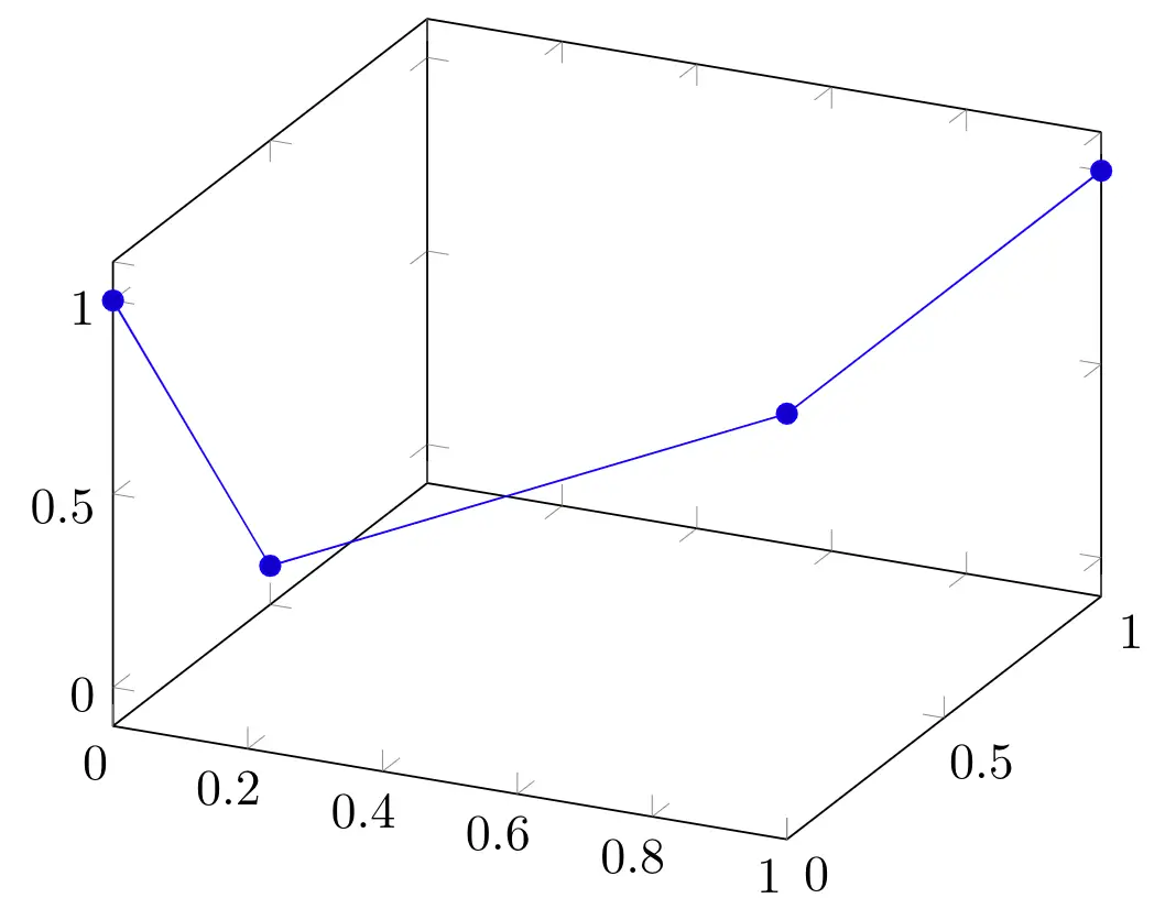
There is a command to plot our coordinates in a three dimensional axis environment, which is \addplot3 coordinates. It only needs three dimensional coordinate points as parameter to produce a line plot.
Let's see an example:
\documentclass [border = .2cm] {standalone}

% Required packages
\usepackage{pgfplots}
\pgfplotsset{compat = newest}

\begin{document}

\begin{tikzpicture}

\begin{axis}

\addplot3 coordinates
{
	(0,0,1)
	(0,0.5,0)
	(1,0,1)
	(1,1,1)
};

\end{axis}

\end{tikzpicture}

\end{document}
Compiling this code yields:
- Using table operation
This command needs a table parameter: the first line consists of the dimension names; x, y and z, and the other lines represents the coordinate points with spaces between each dimension. These lines must only contain the numbers, brackets must came in the next line after the table definition.
Following piece of code creates the same plot using a table command.
\documentclass [border = .2cm] {standalone}

% Required packages
\usepackage{pgfplots}
\pgfplotsset{compat = newest}

\begin{document}

\begin{tikzpicture}

\begin{axis}

\addplot3 table
{
x y   z
0 0   1
0 0.5 0
1 0   1
1 1   1
};

\end{axis}

\end{tikzpicture}

\end{document}
- Data from an external file
If we have these coordinate data in a .dat file, we can use \addplot3 file command to plot our data.
This command needs the relative or absolute path of our dat file in our system as its parameter. Also, our file must contain the coordinate points with a new line between each coordinate and spaces between each dimension.
Example: we created the same plot as our first diagram using file command. For this code to work, you must create a data.dat file with the contents below in the same directory that contains your .tex file.
\documentclass [border = .2cm] {standalone}

% Required packages
\usepackage{pgfplots}
\pgfplotsset{compat = newest}

\begin{document}

\begin{tikzpicture}

\begin{axis}

% data.dat contains:
% 0 0   1
% 0 0.5 0
% 1 0   1
% 1 1   1

\addplot3 file {data.dat};

\end{axis}

\end{tikzpicture}

\end{document}
- 3D plot with a fixed dimension
We can also draw line plots if the data only contains two dimensions, by providing the third dimension as an option to the table command.
Let's say we have a fixed value for y dimension, and we want to use values from a table for x and z dimensions. We can use y expr option to declare the fixed value for y dimension. Additionally, we can declare differently named columns as a dimension, by using the dimension name with the column name as its parameter.
Example: we declared the y value as 1 and added the other dimensions in the table with different column names.
\documentclass [border = .2cm] {standalone}

% Required packages
\usepackage{pgfplots}
\pgfplotsset{compat = newest}

\begin{document}

\begin{tikzpicture}

\begin{axis}

\addplot3 table [y expr = 1, x = col1,	z = col2]
{
col1 col2
-2 0
-1 0
0  0
1  1
2  2
};

\end{axis}

\end{tikzpicture}

\end{document}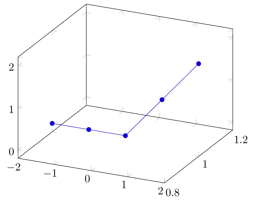
Plotting a function with two variables
We covered the ways we can plot in a 3D environment using coordinate points. If we are trying to plot a function, we can use \addplot3 command with a math expression as its parameter. Using this command, you can plot a function where x=x, y=y, and z=<math expression>.
Example: Let's consider plotting the function:

\documentclass [border = .2cm] {standalone}

% Required packages
\usepackage{pgfplots}
\pgfplotsset{compat = newest}

\begin{document}

\begin{tikzpicture}

\begin{axis}

	\addplot3 {x^2 + y^2};

\end{axis}

\end{tikzpicture}

\end{document}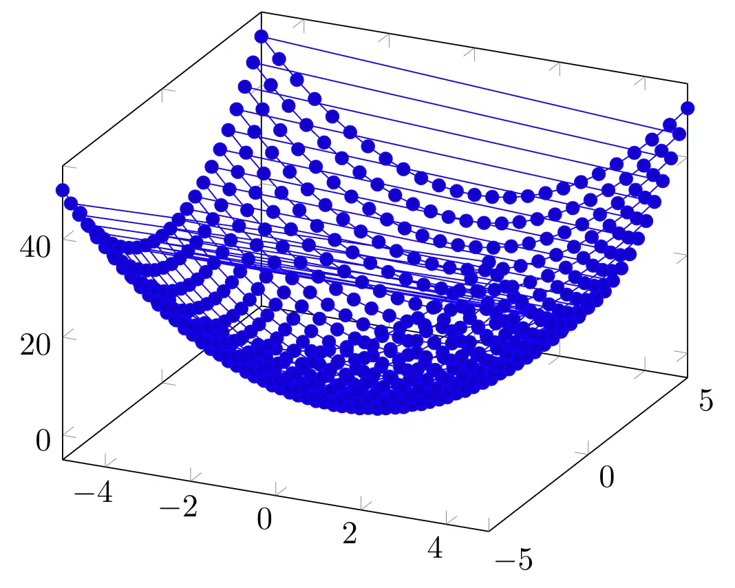
We can create the same function plot with this command using the following code:
\documentclass [border = .2cm] {standalone}

% Required packages
\usepackage{pgfplots}
\pgfplotsset{compat = newest}

\begin{document}

\begin{tikzpicture}

\begin{axis}

	\addplot3 (x, y, {x^2 + y^2});

\end{axis}

\end{tikzpicture}

\end{document}
By changing the function for each dimension, we can draw shifted versions of the function easily. Below, we draw the same function but we shifted x and y dimensions by 5.
\documentclass [border = .2cm] {standalone}

% Required packages
\usepackage{pgfplots}
\pgfplotsset{compat = newest}

\begin{document}

\begin{tikzpicture}

\begin{axis}

	\addplot3 ({x + 5}, {y + 5}, {x^2 + y^2});

\end{axis}

\end{tikzpicture}

\end{document}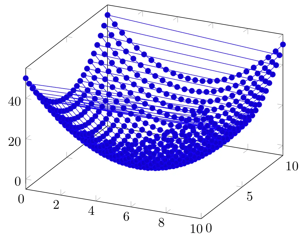
- Set variables' domains
When drawing a function, we can set where the plotting starts and ends by declaring domain intervals.
For x dimension, we can declare the interval by adding a domain option to our \addplot3 command. For y dimension, we need to use y domain command. If we don't declare an option for the y dimension, the domain interval of x will also be assumed for y. In the following piece of code, we set the domain for x at -5:2 and y at -3:1.
\documentclass [border = .2cm] {standalone}

% Required packages
\usepackage{pgfplots}
\pgfplotsset{compat = newest}

\begin{document}

\begin{tikzpicture}

\begin{axis}

	\addplot3+ [domain=-5:2, domain y = -1:3] {x^2 + y^2};

\end{axis}

\end{tikzpicture}

\end{document}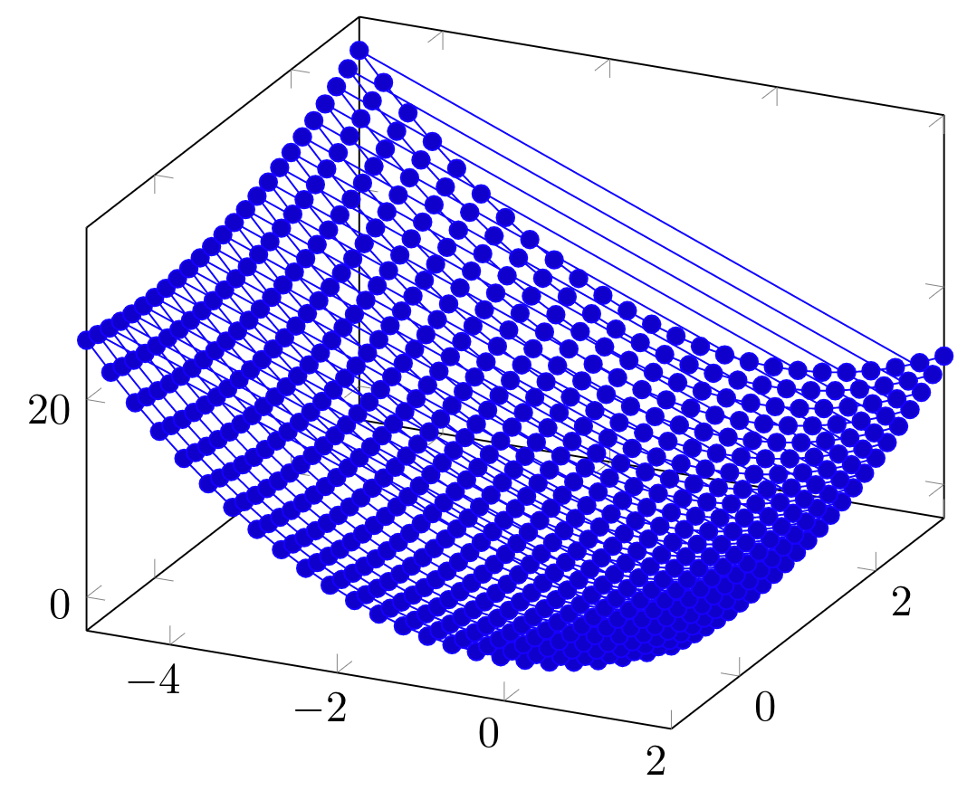
- Specify number of samples
We can also change the sampling size for our function. When we use a plotting command, PGFPlots calculates the function for a sample of numbers and connects them to create a plot. We can change this number using samples option for x dimension and samples y option for y dimension. Just like the domain option, if we don't declare a sample size for y dimension, it assumes the sample size of x as it is also for y. In the next example, we used 20 samples for x dimension and 8 samples for y dimension.
\documentclass [border = .2cm] {standalone}

% Required packages
\usepackage{pgfplots}
\pgfplotsset{compat = newest}

\begin{document}

\begin{tikzpicture}

\begin{axis}

\addplot3+ [
	domain=-5:2,
	domain y = -3:1,
	samples = 20,
	samples y = 8] {x^2 + y^2};

\end{axis}

\end{tikzpicture}

\end{document}
- Smooth plot option
Having more samples creates a continuous look in our plot. Since the connections between the sample points are linear, the more sample means less discrete lines and it looks smoother. We can also help this with smooth option. It interpolates the connecting lines and creates a less clunky look. Below, we used this option with our plot.
\documentclass [border = .2cm] {standalone}

% Required packages
\usepackage{pgfplots}
\pgfplotsset{compat = newest}

\begin{document}

\begin{tikzpicture}

\begin{axis}

\addplot3+ [
	domain=-5:2,
	domain y = -3:1,
	samples = 20,
	samples y = 8,
	smooth] {x^2 + y^2};

\end{axis}

\end{tikzpicture}

\end{document}
Scatter Plots
- Only marks
We can create scatter plots in three dimensional axis in the same way as we are using in two dimensional axis. If we only need mark points in our plot, we can use only marks option.
\documentclass [border = .2cm] {standalone}

% Required packages
\usepackage{pgfplots}
\pgfplotsset{compat = newest}

\begin{document}

\begin{tikzpicture}

\begin{axis}

\addplot3+ [
	domain=-5:2,
	domain y = -3:1,
	samples = 20,
	samples y = 8,
	only marks] {x^2 + y^2};

\end{axis}

\end{tikzpicture}

\end{document}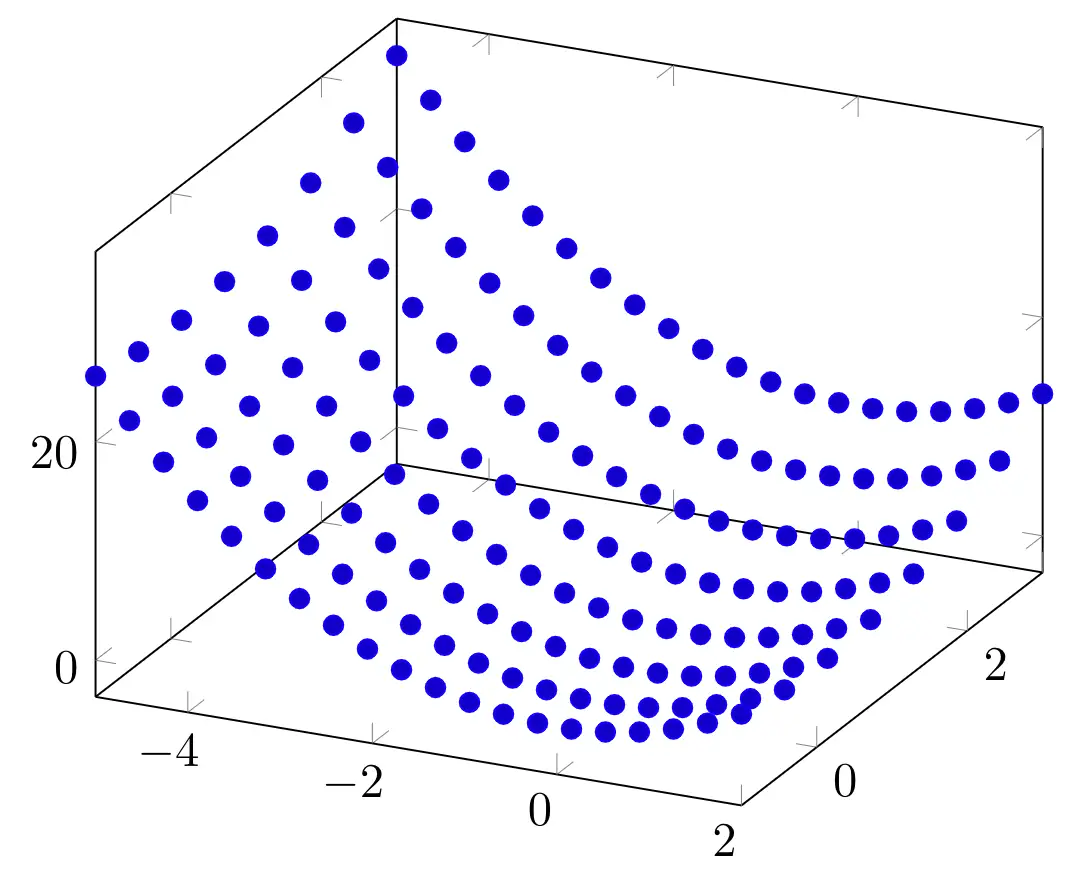
- Set color of scatter plot
If we also add the scatter option, the mark points will be shown with the colors of the current colormap. These colors will change according to the z values of our data.
\documentclass [border = .2cm] {standalone}

% Required packages
\usepackage{pgfplots}
\pgfplotsset{compat = newest}

\begin{document}

\begin{tikzpicture}

\begin{axis}

\addplot3 [
	domain=-5:2,
	domain y = -3:1,
	samples = 20,
	samples y = 8,
	only marks,
	scatter] {x^2 + y^2};

\end{axis}

\end{tikzpicture}

\end{document}
Compiling this code yields:
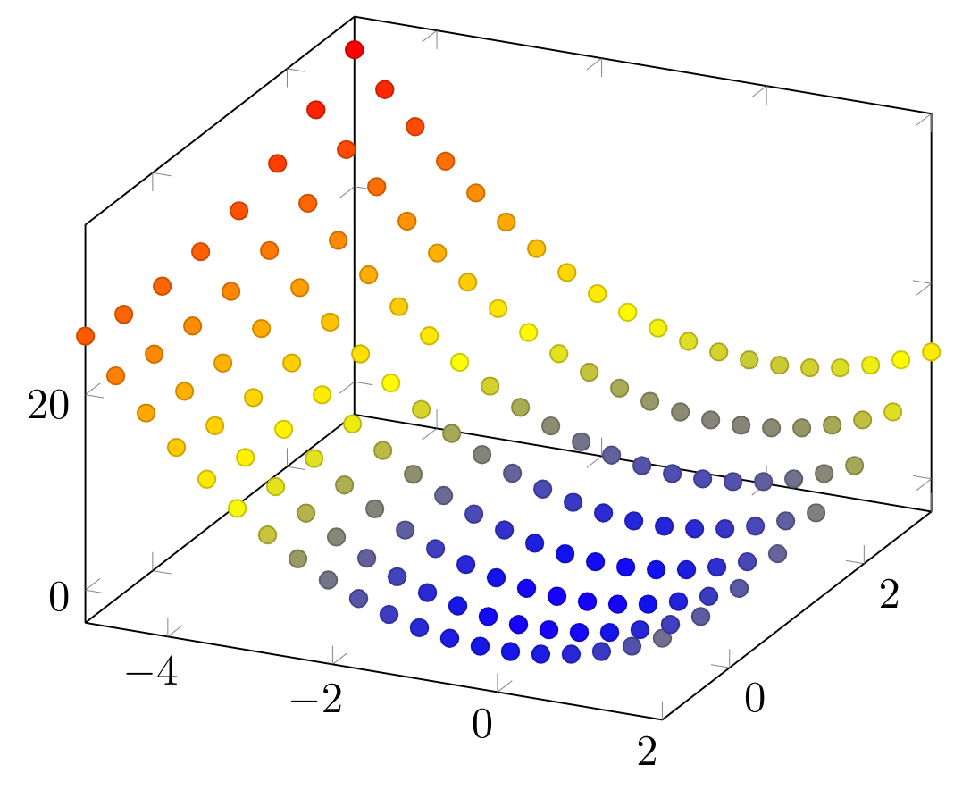
If we want to have a fixed color for all the marks, we can change the color by adding the color name as an option. In the following example, we kept the only marks option, and used a tone of orange for the coloring.
\documentclass [border = .2cm] {standalone}

% Required packages
\usepackage{pgfplots}
\pgfplotsset{compat = newest}

\begin{document}

\begin{tikzpicture}

\begin{axis}

\addplot3 [
	domain=-5:2,
	domain y = -3:1,
	samples = 20,
	samples y = 8,
	only marks,
	orange] {x^2 + y^2};

\end{axis}

\end{tikzpicture}

\end{document}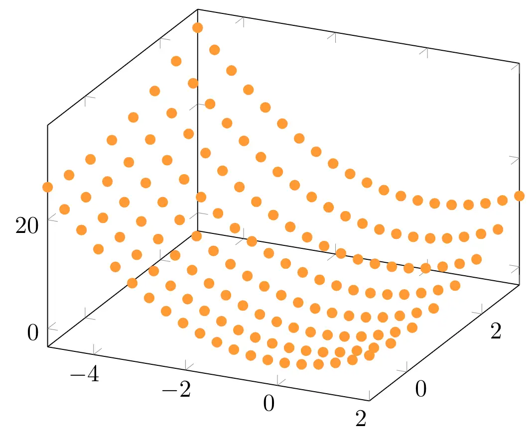
- Marks style
Additionally, we can change the mark shapes using the mark option. We have lots of mark shape choices with pgfplots, such as * for filled circles, x for x symbols, + for + symbols, o for empty circles, square* for filled squares, etc.
Example: In the following code, we changed the marks with x symbols.
\documentclass [border = .2cm] {standalone}

% Required packages
\usepackage{pgfplots}
\pgfplotsset{compat = newest}

\begin{document}

\begin{tikzpicture}

\begin{axis}

\addplot3 [
	domain=-5:2,
	domain y = -3:1,
	samples = 20,
	samples y = 8,
	only marks,
	orange,
	mark = x] {x^2 + y^2};

\end{axis}

\end{tikzpicture}

\end{document}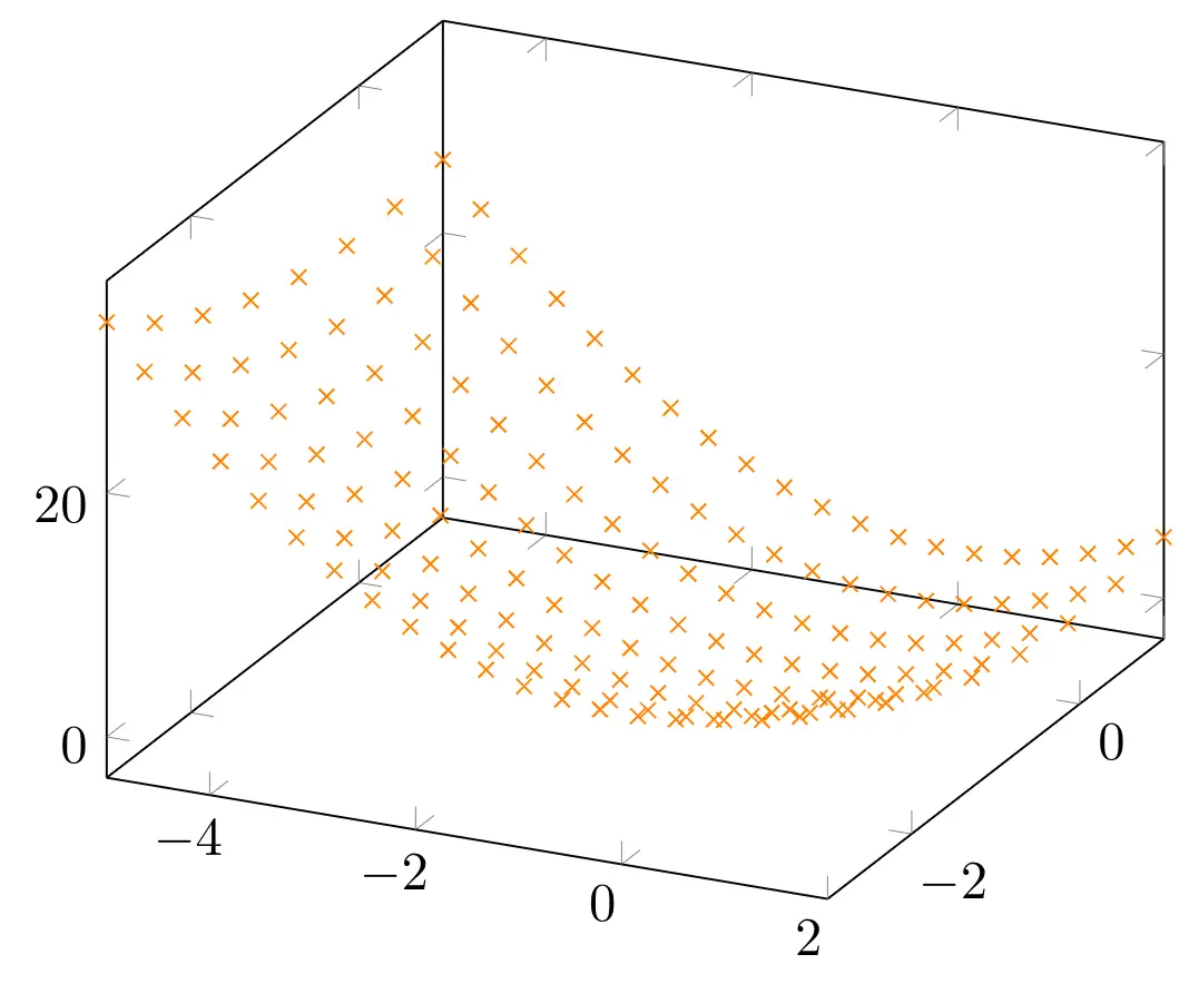
Mesh Plots
- Mesh option
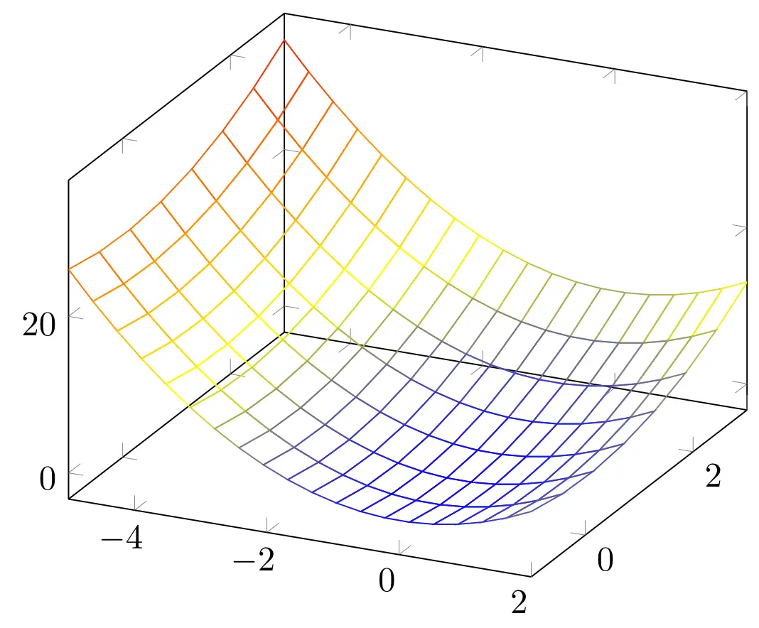
A mesh plot uses the same idea as scatter but for creating a mesh between the sample points. It will be colored differently according to the z values of our data. We can use the option mesh to create a mesh plot.
\documentclass [border = .2cm] {standalone}

% Required packages
\usepackage{pgfplots}
\pgfplotsset{compat = newest}

\begin{document}

\begin{tikzpicture}

\begin{axis}

\addplot3 [
	domain=-5:2,
	domain y = -3:1,
	samples = 20,
	samples y = 8,
	mesh] {x^2 + y^2};

\end{axis}

\end{tikzpicture}

\end{document}
Compiling this code yields:
- Set mesh color
We can set the color by using the draw option with a color parameter. In the following code, we draw a green mesh.
\documentclass [border = .2cm] {standalone}

% Required packages
\usepackage{pgfplots}
\pgfplotsset{compat = newest}

\begin{document}

\begin{tikzpicture}

\begin{axis}

\addplot3 [
	domain=-5:2,
	domain y = -3:1,
	samples = 20,
	samples y = 8,
	mesh,
	draw = green!70!black] {x^2 + y^2};

\end{axis}

\end{tikzpicture}

\end{document}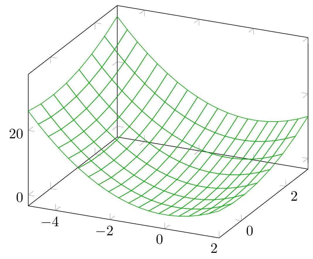
- Set line thickness
If we want to change the width of the mesh lines, we can do that using a line width shortcut. By default, the lines are thin. We can use various shortcuts from ultra thin, very thin, to semithick, thick, very thick and ultra thick.
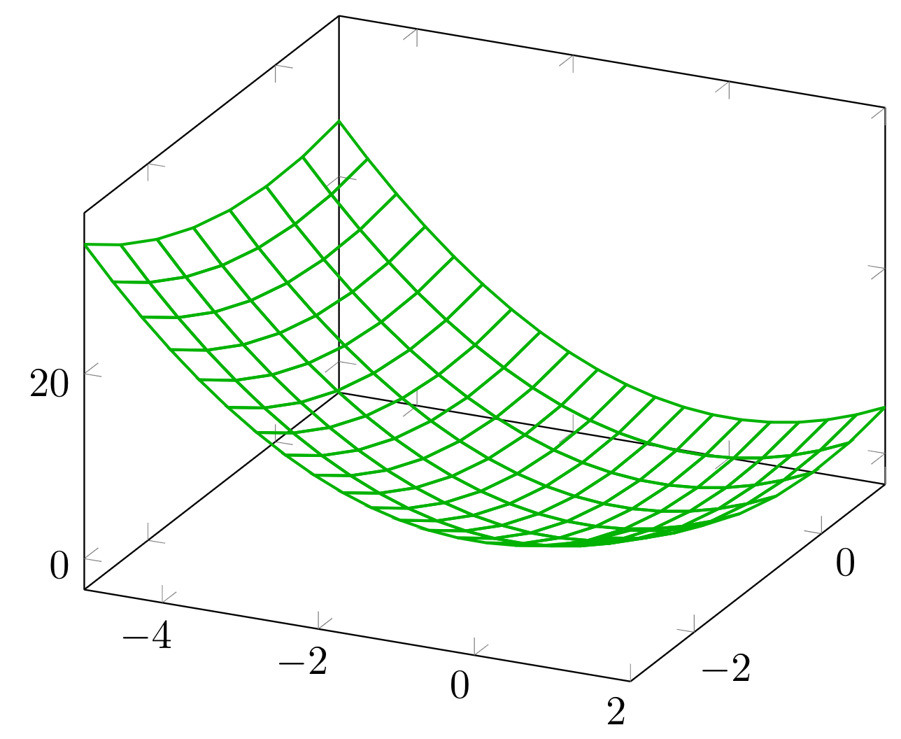
If we need to set it to a certain level of thickness, we can also use line width option with the thickness value we need. Below, we set the line width to 0.7 pt.
\documentclass [border = .2cm] {standalone}

% Required packages
\usepackage{pgfplots}
\pgfplotsset{compat = newest}

\begin{document}

\begin{tikzpicture}

\begin{axis}

\addplot3 [
	domain=-5:2,
	domain y = -3:1,
	samples = 20,
	samples y = 8,
	mesh,
	draw = green!70!black,
	line width = 0.7pt] {x^2 + y^2};

\end{axis}

\end{tikzpicture}

\end{document}
which yields the following illustration:
- Mesh with scatter points
We can use mesh plots with scatter points easily by adding scatter option to our usual plot. Here is an example:
\documentclass [border = .2cm] {standalone}

% Required packages
\usepackage{pgfplots}
\pgfplotsset{compat = newest}

\begin{document}

\begin{tikzpicture}

\begin{axis}

\addplot3 [
	domain=-5:2,
	domain y = -3:1,
	samples = 20,
	samples y = 8,
	mesh,
	scatter] {x^2 + y^2};

\end{axis}

\end{tikzpicture}

\end{document}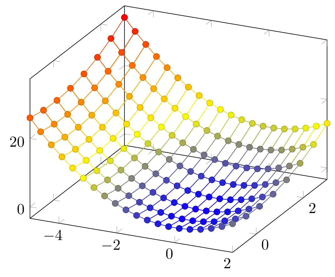
Surface Plots
A surface plot places rectangle shaped patches between the sample points and fills them using the current colormap according to their value in z dimension. We can draw a surface plot by using surf option. In the following piece of code, we created a surface plot of our diagram.
\documentclass [border = .2cm] {standalone}

% Required packages
\usepackage{pgfplots}
\pgfplotsset{compat = newest}

\begin{document}

\begin{tikzpicture}

\begin{axis}

\addplot3 [
	domain=-5:2,
	domain y = -3:1,
	samples = 20,
	samples y = 8,
	surf] {x^2 + y^2};

\end{axis}

\end{tikzpicture}

\end{document}
- Shader options: faceted, flat and interp
We can configure how the color of each single vertex is used to fill the surface patches using shader option. Initially, this option comes with faceted parameter, which is the version seen above. We can also use it with flat option: it will use the filling color to draw the mesh borders. Below, we draw the same diagram with the flat option.
\documentclass [border = .2cm] {standalone}

% Required packages
\usepackage{pgfplots}
\pgfplotsset{compat = newest}

\begin{document}

\begin{tikzpicture}

\begin{axis}

\addplot3 [
	domain=-5:2,
	domain y = -3:1,
	samples = 20,
	samples y = 8,
	surf,
	shader = flat] {x^2 + y^2};

\end{axis}

\end{tikzpicture}

\end{document}
Another shader option we have is the interp option. It uses a linear interpolation of two triangles approximating rectangles and produces a smooth filling. Below, we draw the same plot with an interp shader.
\documentclass [border = .2cm] {standalone}

% Required packages
\usepackage{pgfplots}
\pgfplotsset{compat = newest}

\begin{document}

\begin{tikzpicture}

\begin{axis}

\addplot3 [
	domain=-5:2,
	domain y = -3:1,
	samples = 20,
	samples y = 8,
	surf,
	shader = interp] {x^2 + y^2};

\end{axis}

\end{tikzpicture}

\end{document}
- Faceted color
When using a faceted option, we can also change the color of the faceted lines by using faceted color option. Below, we used a faceted interp shader and teal faceted lines.
\documentclass [border = .2cm] {standalone}

% Required packages
\usepackage{pgfplots}
\pgfplotsset{compat = newest}

\begin{document}

\begin{tikzpicture}

\begin{axis}

\addplot3 [
	domain=-5:2,
	domain y = -3:1,
	samples = 20,
	samples y = 8,
	surf,
	shader = faceted interp,
	faceted color = teal] {x^2 + y^2};

\end{axis}

\end{tikzpicture}

\end{document}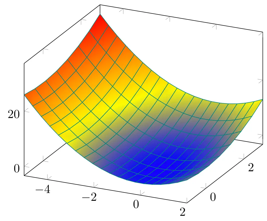
- Fill color
If we don't want to use a colormap, we can set the filling color of the surface plot by using fill option with a color parameter. Below, we removed the shader options and filled the surface with pink without changing the faceted lines.
\documentclass [border = .2cm] {standalone}

% Required packages
\usepackage{pgfplots}
\pgfplotsset{compat = newest}

\begin{document}

\begin{tikzpicture}

\begin{axis}

\addplot3 [
	domain=-5:2,
	domain y = -3:1,
	samples = 20,
	samples y = 8,
	surf,
	fill=pink,
	faceted color = teal] {x^2 + y^2};

\end{axis}

\end{tikzpicture}

\end{document}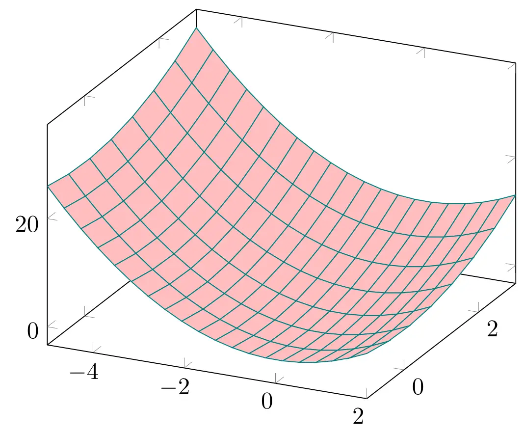
Styling 3D Plots
We went over how to create line, scatter, mesh and surface plots in a three dimensional environment. Now let's turn our focus on how to change the other aspects of the diagram.
- Colormap
First of all, we can change the colormap of the scatter, mesh and surface plots. The default colormap is named hot, and can be selected by adding colormap/hot option to the axis. The other predefined colormaps are hot2, jet, blackwhite, bluered, cool, greenyellow, redyellow, and violet.
Example: we changed the colormap of a surface plot to cool. Here is the corresponding code:
\documentclass [border = .2cm] {standalone}

% Required packages
\usepackage{pgfplots}
\pgfplotsset{compat = newest}

\begin{document}

\begin{tikzpicture}

\begin{axis}[colormap/cool]

\addplot3 [
	domain=-5:2,
	domain y = -3:1,
	samples = 20,
	samples y = 8,
	surf] {x^2 + y^2};

\end{axis}

\end{tikzpicture}

\end{document}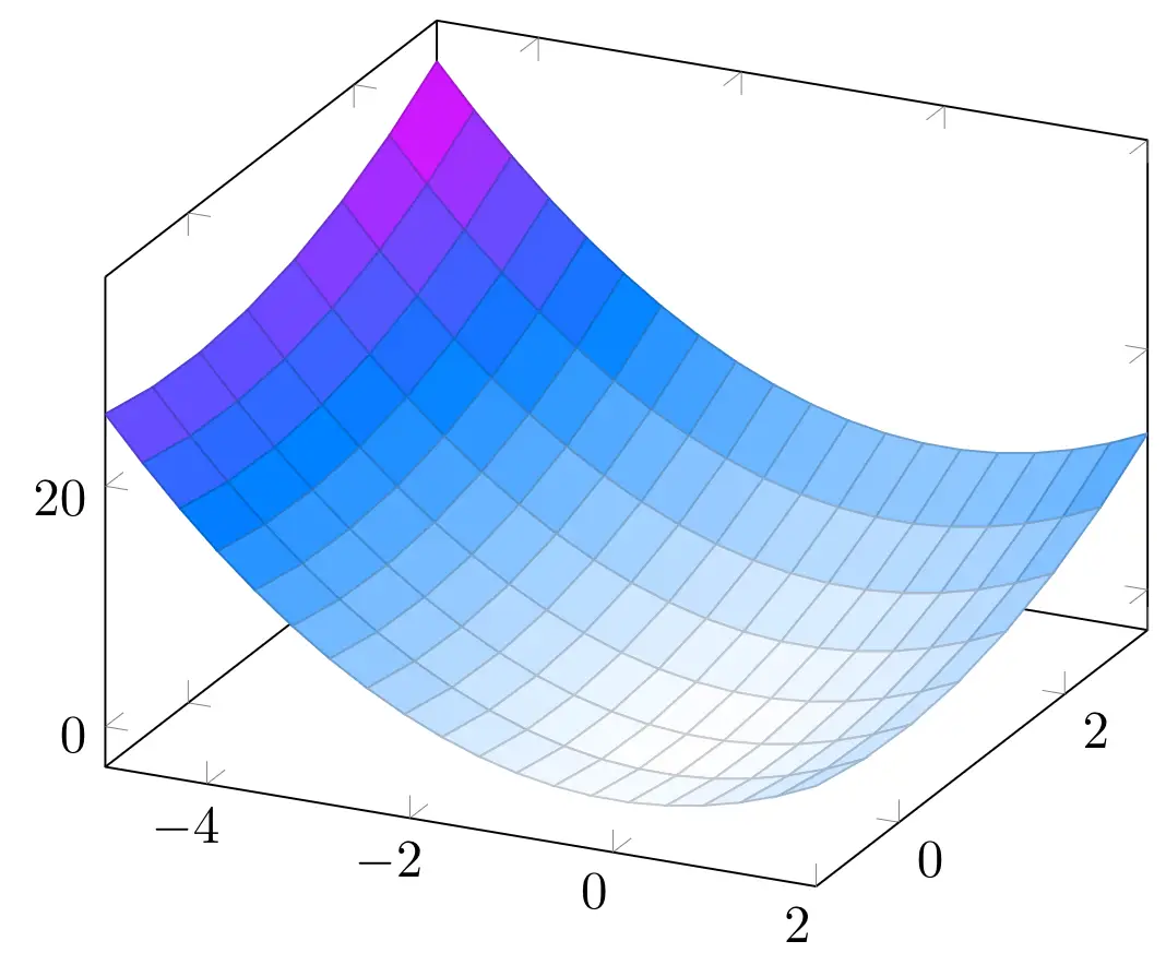
- Colorbar
We can also include a colorbar in the diagram to represent the colors according to their values. To include a colorbar, we can use colorbar keyword in our axis styling options.
There are three kinds of positioning options for the colorbar: colorbar left places a vertical colorbar to the left of the diagram, colorbar right places it to the right, and colorbar horizontal places a horizontal colorbar below the diagram. In the following piece of code, we placed a horizontal colorbar for our surface plot.
\documentclass [border = .2cm] {standalone}

% Required packages
\usepackage{pgfplots}
\pgfplotsset{compat = newest}

\begin{document}

\begin{tikzpicture}

\begin{axis}[colormap/cool, colorbar horizontal]

\addplot3 [
	domain=-5:2,
	domain y = -3:1,
	samples = 20,
	samples y = 8,
	surf] {x^2 + y^2};

\end{axis}

\end{tikzpicture}

\end{document}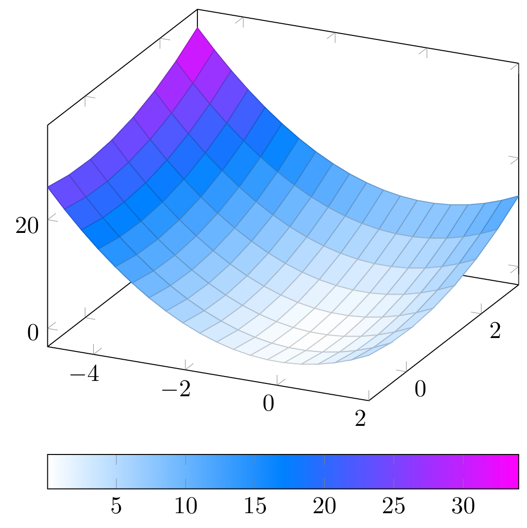
- Axis lines
Three dimensional plots are usually shown inside a box axis. However, we can change this easily using axis lines option with a positioning parameter, such as left, right, center, box, or none. Its default value is box.
In the next example we returned back to the default colormap, removed the colorbar and changed the current axis positioning to left.
\documentclass [border = .2cm] {standalone}

% Required packages
\usepackage{pgfplots}
\pgfplotsset{compat = newest}

\begin{document}

\begin{tikzpicture}

\begin{axis}[axis lines = left]

\addplot3 [
	domain=-5:2,
	domain y = -3:1,
	samples = 20,
	samples y = 8,
	surf] {x^2 + y^2};

\end{axis}

\end{tikzpicture}

\end{document}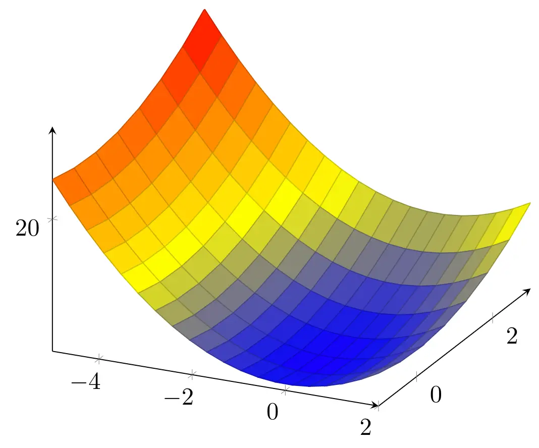
In some cases, the plot can stand in front of the axis. We can set the axis to be always on the top layer with axis on top option. In the next piece of code, we set the axis lines to be at the center of the diagram, and put them on top. We also draw the lines thicker with a dark red color by changing axis line style option to make the lines more visible.
\documentclass [border = .2cm] {standalone}

% Required packages
\usepackage{pgfplots}
\pgfplotsset{compat = newest}

\begin{document}

\begin{tikzpicture}

\begin{axis}[axis lines = center, axis on top, axis line style = {thick, red!80!black}]

\addplot3 [
	domain=-5:2,
	domain y = -3:1,
	samples = 20,
	samples y = 8,
	surf] {x^2 + y^2};

\end{axis}

\end{tikzpicture}

\end{document}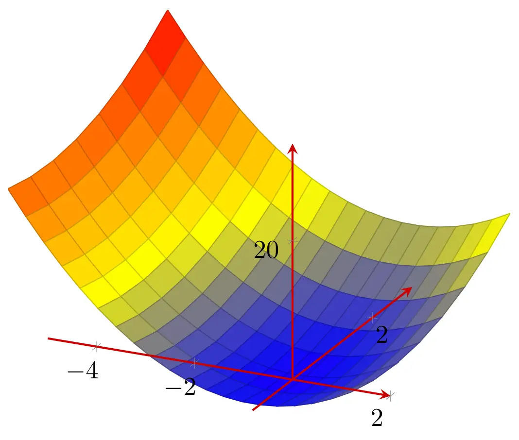
- Change plot 3D view
Since we are working with a three dimensional figure, another option we can set is the angle we are viewing the plot. We can alter the viewing angle in two directions, the first one is the horizontal angle which is rotated around the z axis, and the second one is the vertical angle which is rotated around the x axis. We can change these angles using view option to style our axis environment. This option has the default value of 25degrees for the horizontal angle and 30degrees for the vertical angle.
In the next piece of code, we set the horizontal angle to 50degrees and the vertical angle to 40degrees.
\documentclass [border = .2cm] {standalone}

% Required packages
\usepackage{pgfplots}
\pgfplotsset{compat = newest}

\begin{document}

\begin{tikzpicture}

\begin{axis}[view = {50}{40}]

\addplot3 [
	domain=-5:2,
	domain y = -3:1,
	samples = 20,
	samples y = 8,
	surf] {x^2 + y^2};

\end{axis}

\end{tikzpicture}

\end{document}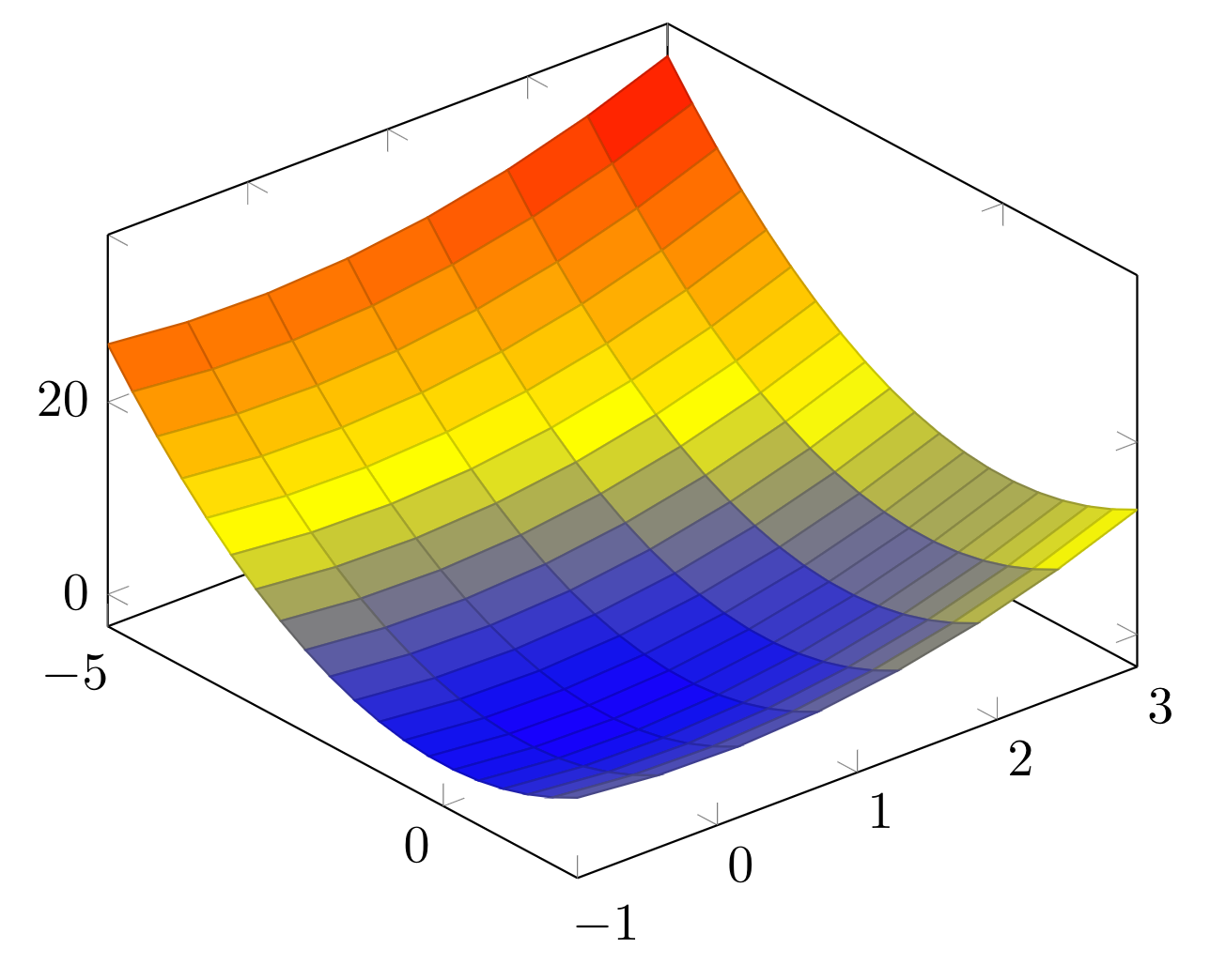
- Set axes limits
We have the option to set the maximum and minimum values for all three dimensions. We can declare the limits using xmax, xmin, ymax, ymin, zmax, and zmin options for our axis environment.
In the next example, we set the limits for x dimension between -6 and 4, y dimension between -3 and 3 and z dimension between -10 and 50.
\documentclass [border = .2cm] {standalone}

% Required packages
\usepackage{pgfplots}
\pgfplotsset{compat = newest}

\begin{document}

\begin{tikzpicture}

\begin{axis}[view = {50}{40},
	xmax = 4,
	xmin = -6,
	ymax = 3,
	ymin = -3,
	zmax = 50,
	zmin = -10]

\addplot3 [
	domain=-5:2,
	domain y = -3:1,
	samples = 20,
	samples y = 8,
	surf] {x^2 + y^2};

\end{axis}

\end{tikzpicture}

\end{document}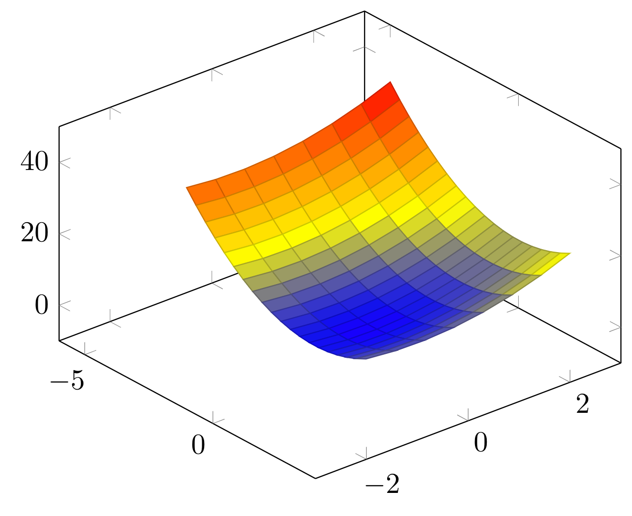
- Custom ticks labels
If we want to emphasize certain coordinates in the axes, we can specify which tick points will be drawn by using x ticks, y ticks and z ticks options in our axis environment. These commands needs one or more coordinates in the axis, and these points need to be inside the limits we declared previously. Below, we set a different set of tick points.
\documentclass [border = .2cm] {standalone}

% Required packages
\usepackage{pgfplots}
\pgfplotsset{compat = newest}

\begin{document}

\begin{tikzpicture}

\begin{axis}[view = {50}{40},
	xmax = 4,
	xmin = -6,
	ymax = 3,
	ymin = -3,
	zmax = 50,
	zmin = -10,
	xtick = {-6,-4,-2,0,2,4},
	ytick = {-3,0,3},
	ztick = {-10,10,30,50}]

\addplot3 [
	domain=-5:2,
	domain y = -3:1,
	samples = 20,
	samples y = 8,
	surf] {x^2 + y^2};

\end{axis}

\end{tikzpicture}

\end{document}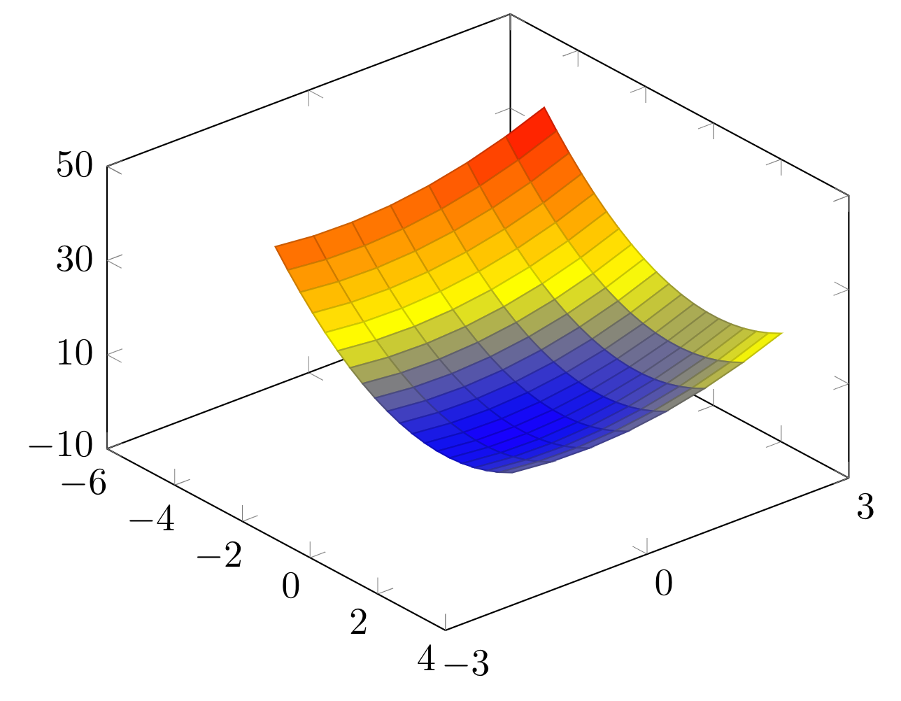
- Add grid and style it
To show the tick points better on the plot, we can draw grid lines on the axis using grid option. If we don't need to draw any grids on a dimension, we can also set it off for just that dimension.
Let's say we don't need any grid lines for y dimension; all we need to do is to add ymajorgrids = false option to our axis environment. For x and z dimensions, we should use xmajorgrids and zmajorgrids options, respectively. In the next piece of code, we added grids to our plot, but removed the ones for y dimension.
\documentclass [border = .2cm] {standalone}

% Required packages
\usepackage{pgfplots}
\pgfplotsset{compat = newest}

\begin{document}

\begin{tikzpicture}

\begin{axis}[view = {50}{40},
	xmax = 4,
	xmin = -6,
	ymax = 3,
	ymin = -3,
	zmax = 50,
	zmin = -10,
	xtick = {-6,-4,-2,0,2,4},
	ytick = {-3,0,3},
	ztick = {-10,10,30,50},
	grid,
	ymajorgrids = false]

\addplot3 [
	domain=-5:2,
	domain y = -3:1,
	samples = 20,
	samples y = 8,
	surf] {x^2 + y^2};

\end{axis}

\end{tikzpicture}

\end{document}
- Unit vector ratio
In our plot, z dimension has an interval of 60, and x dimension has an interval of 10, but the length of the z dimension is not six times the length of the x dimension. The reason for this is our drawing environment trying to create an easy to understand plot. However, we can change the ratios between dimensions using unit vector ratio command. It takes three parameters that is representing the aspect ratio for each dimension.
If we need the same ratio for all of the dimensions, we can use the same parameter three times. If we need twice the size for y dimension, we can set it to 1 2 1. Below, we set the ratios to 10 10 1.
\documentclass [border = .2cm] {standalone}

% Required packages
\usepackage{pgfplots}
\pgfplotsset{compat = newest}

\begin{document}

\begin{tikzpicture}

\begin{axis}[view = {50}{40},
	xmax = 4,
	xmin = -6,
	ymax = 3,
	ymin = -3,
	zmax = 50,
	zmin = -10,
	xtick = {-6,-4,-2,0,2,4},
	ytick = {-3,0,3},
	ztick = {-10,10,30,50},
	grid,
	ymajorgrids = false,
	unit vector ratio = 10 10 1]

\addplot3 [
	domain=-5:2,
	domain y = -3:1,
	samples = 20,
	samples y = 8,
	surf] {x^2 + y^2};

\end{axis}

\end{tikzpicture}

\end{document}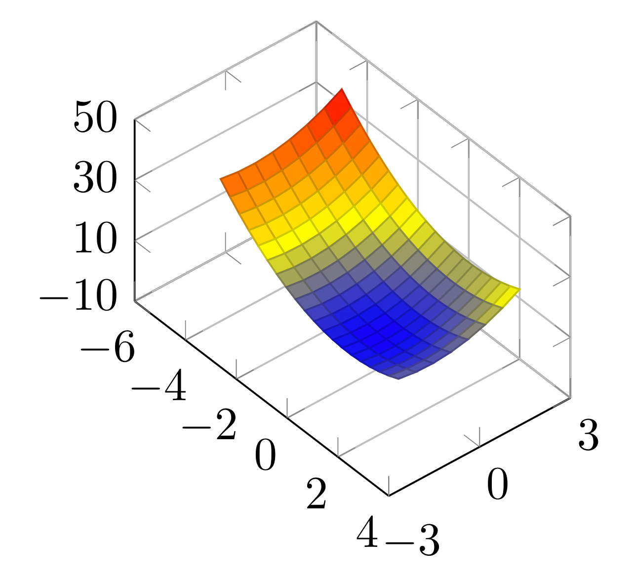
- 3D box
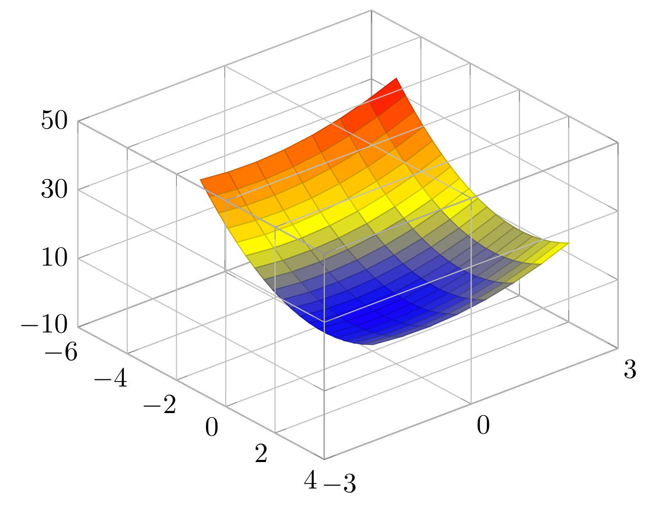
As a final option, we will add 3d box command to our plot. This command helps draw all the borders of the cuboid shape of our axes. To make this happen, we need to use the command with complete parameter. We can also use it with complete* parameter to draw the grid lines on all sides of our cuboid axes. Below, we removed unit vector ratio and ymajorgrids = false commands and added the 3d box command with complete* option.
\documentclass [border = .2cm] {standalone}

% Required packages
\usepackage{pgfplots}
\pgfplotsset{compat = newest}

\begin{document}

\begin{tikzpicture}

\begin{axis}[view = {50}{40},
	xmax = 4,
	xmin = -6,
	ymax = 3,
	ymin = -3,
	zmax = 50,
	zmin = -10,
	xtick = {-6,-4,-2,0,2,4},
	ytick = {-3,0,3},
	ztick = {-10,10,30,50},
	grid,
	3d box = complete*]

\addplot3 [
	domain=-5:2,
	domain y = -3:1,
	samples = 20,
	samples y = 8,
	surf] {x^2 + y^2};

\end{axis}

\end{tikzpicture}

\end{document}
Compiling this code yields:
This concludes our three dimensional plotting in PGFPlots tutorial. For more details, you can check the PGFplots manual.
