Drawing a Pie Chart in LaTeX
A pie chart might represent used shots per player in a basketball game, or how a budget had been spent on different categories in a period of time. Although alone, they don't give much detail about their subject, but they are great for summarizing information, emphasizing the portions of categories and adding detail to other data visualization tools.
Illustrative Example
Before starting to create our environment, first, we need to have data to visualize. Let's say that we want to visualize NBA teams which have won the championship trophy. We can gather the data for total championships won by each team and their percentage of winning from a wikipedia article on this topic. Let's say we want to emphasize the teams who won at least five cups, and sum other teams in the Other Teams category. As of 2021, our data will look like this:
Team | Win | Percentage |
|---|---|---|
Los Angeles Lakers | 17 | 22.97% |
Boston Celtics | 17 | 22.97 |
Golden State Warriors | 6 | 8.11% |
Chicago Bulls | 6 | 8.11% |
San Antonio Spurs | 5 | 6.76% |
Other Teams | 23 | 31.07 |
Total | 74 | 100% |
PGF-PIE package
Now that we gathered our data, we can create our drawing environment. We only need pgf-pie package, which is built on top of PGF and TikZ. Then we can create a tikzpicture environment and begin drawing.
 \documentclass[border=0.2cm]{standalone}

% Pie chart drawing library
\usepackage{pgf-pie}

\begin{document}

\begin{tikzpicture}
	% We will draw the pie chart here
\end{tikzpicture}

\end{document}
\pie command
Creating a pie chart is really easy with pgf-pie, the most important thing to have is the percentage values for our categories. If we know each percentage, we can easily create our pie chart with one simple command, \pie. We need to feed the command with each of our percentage and label information in following manner:
\begin{tikzpicture}

\pie{22.97/Los Angeles Lakers,
	22.97/Boston Celtics,
	8.11/Golden State Warriors,
	8.11/Chicago Bulls,
	6.76/San Antonio Spurs,
	31.07/Other Teams}

\end{tikzpicture}
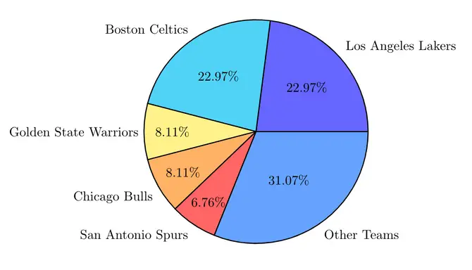
Pie chart drawn in LaTeX using pgf-pie package
It's that simple to create a solid pie chart!
Customize Pie chart appearance in LaTeX
Now that we easily created our first pie chart example, let's try different options provided by pgf-pie package.
Radius of Pie chart
By default, the pie chart radius is equal to 3. To change the size of our chart, we add radius=<value> to the \pie command. Anything more than 3 will increase the size, and values below 3 will make our chart smaller. Here is an example:
\begin{tikzpicture}

\pie{25/L1, 30/L2, 45/L3}
\pie[pos={7,0},radius=2]{25/L1, 30/L2, 45/L3}

\end{tikzpicture}
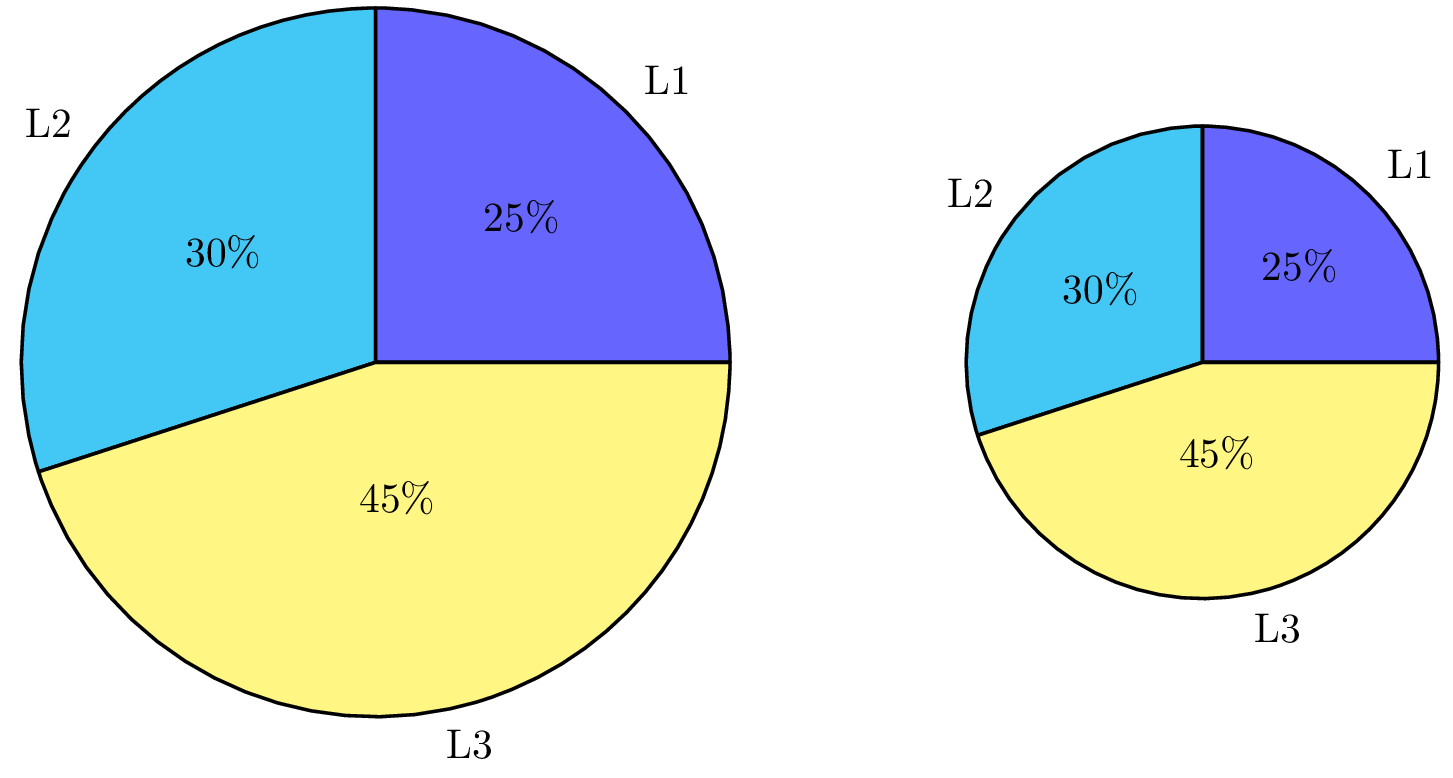
Pie chart in LaTeX with different radii
Multiple Pie charts
In the previous example, we have used the \pie command twice to generate two pie charts with different radii. To achieve that we have to change the position of the second pie chart. This can be done using the option pos={x,y}. The latter specifies the x and y coordinates of the second chart. By default, the pie chart is positioned at (0,0).
Rotate a Pie chart
We can also rotate our slices' positions using rotate option. Its default value is 0, and it'll rotate our chart counterclockwise with given angle value. Here is an example of pie charts with different rotations.
\begin{tikzpicture}

% Pie chart 1
\pie{10/A, 20/B, 30/C, 40/D}

% Pie chart 2
\pie[
	pos = {7.5,0},
	rotate = 90
]{10/A, 20/B, 30/C, 40/D}

\end{tikzpicture}
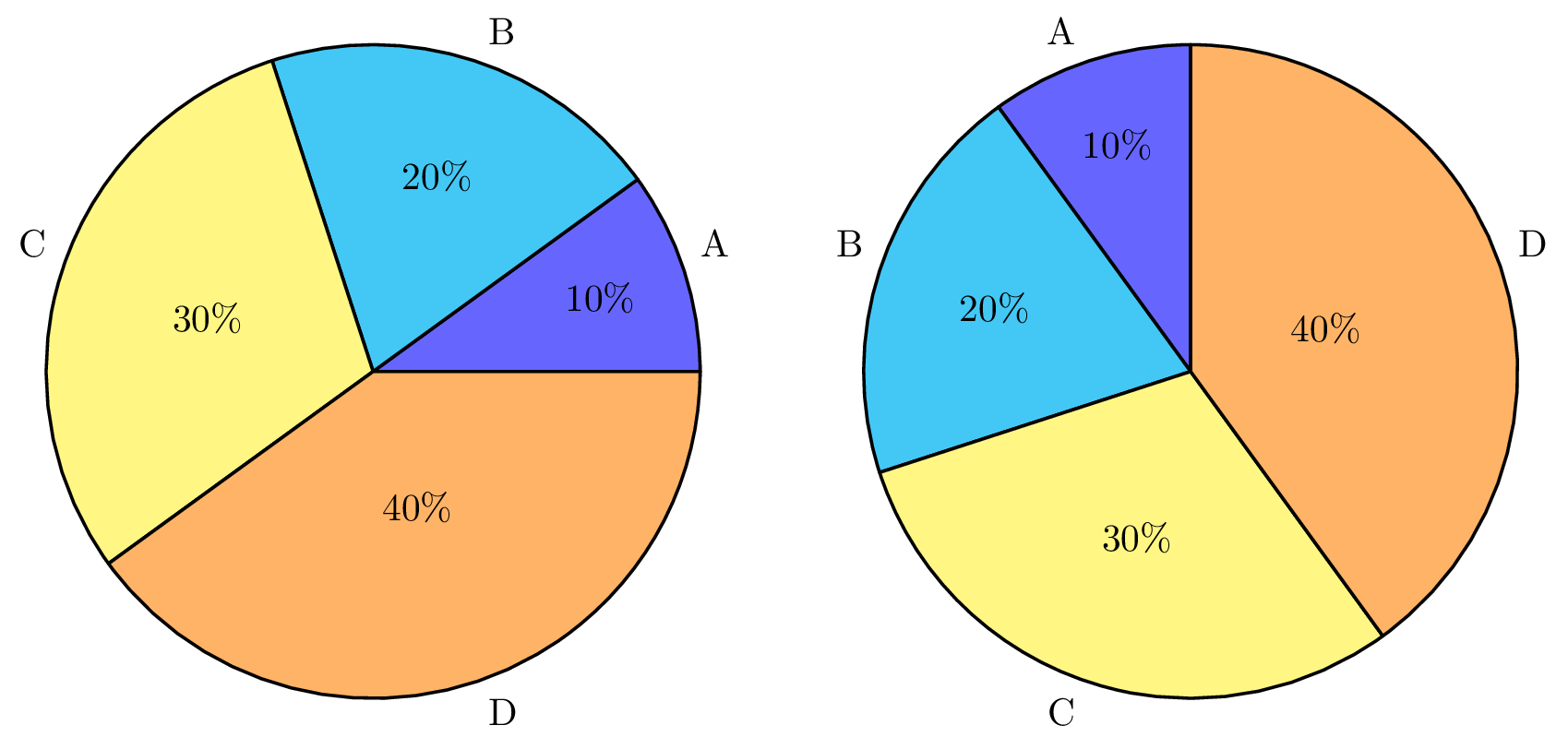
Rotate a pie chart in LaTeX using rotate option
Change the Pie chart color
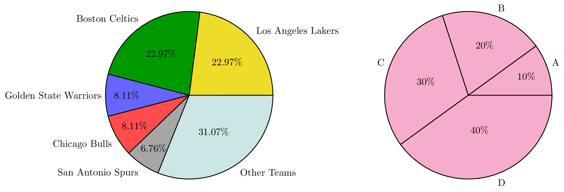
We also have the opportunity to change the color of our pie chart or the individual slices by using color option.
If we want to make the whole chart the same color, it's enough to give one parameter to the option. To have different colors with each slice, we need to feed the parameter with as many colors as there are slices. Following code shows our different options.
\begin{tikzpicture}

% Pie chart 1
\pie[
	color = {
		yellow!90!black,
		green!60!black,
		blue!60, red!70,
		gray!70,
		teal!20}
]{22.97/Los Angeles Lakers,
	22.97/Boston Celtics,
	8.11/Golden State Warriors,
	8.11/Chicago Bulls,
	6.76/San Antonio Spurs,
	31.07/Other Teams
}

% Pie chart 2
\pie[
	pos = {10,0},
	color = magenta!40
]{10/A, 20/B, 30/C, 40/D}

\end{tikzpicture}
Compiling the above LaTeX code yields:
Pie chart slice explode
Now we have colors to help our story, but if we want to make one slice pop, we can use explode option. The option divides our slices by a given parameter. As in color option, we can explode all our slices at the same rate or have different gaps between each slice. Let's see our options:
\begin{tikzpicture}

% Pie chart 1
\pie[
	color = {
		yellow!90!black,
		green!60!black,
		blue!60,
		red!70,
		gray!70,
		teal!20
	},
	explode = 0.1
]{22.97/Los Angeles Lakers,
	22.97/Boston Celtics,
	8.11/Golden State Warriors,
	8.11/Chicago Bulls,
	6.76/San Antonio Spurs,
	31.07/Other Teams
}

% Pie chart 2
\pie[
	pos = {10,0},
	color = magenta!40,
	explode = {0.4, 0, 0, 0}
]{10/A, 20/B, 30/C, 40/D}

\end{tikzpicture}

Explode slices in Pie charts LaTeX
Hide numbers in Pie charts
Now let's focus on formatting our text elements. In some charts we may want to hide our numbers to create a more clean-looking chart. We can achieve this easily using hide number option.
\begin{tikzpicture}

% Pie chart
\pie[
	color = {
		yellow!90!black,
		green!60!black,
		blue!60,
		red!70,
		gray!70,
		teal!20},
	hide number
]
{22.97/Los Angeles Lakers,
	22.97/Boston Celtics,
	8.11/Golden State Warriors,
	8.11/Chicago Bulls,
	6.76/San Antonio Spurs,
	31.07/Other Teams
}

\end{tikzpicture}
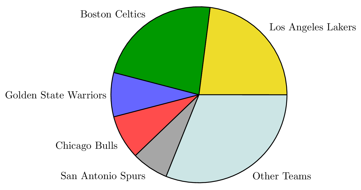
Hide numbers in LaTeX Pie charts
Put text labels inside Pie chart
We can also format our label texts using pgf-pie options. One thing we can do is to put our labels in the slices using only text = inside command, we can use this command to create a small, compact chart. To make the text fit, we can abbreviate the team names.
\begin{tikzpicture}

\pie[
	text = inside
]{22.97/LAL,
	22.97/BC,
	8.11/GSW,
	8.11/CB,
	6.76/SAS,
	31.07/Other
}

\end{tikzpicture}
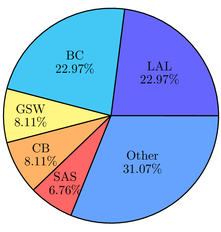
Text inside LaTeX pie chart
Add a Legend to a Pie chart
To add a legend to our pie chart, we use the option text = legend with the \pie command. Here is an example:
\begin{tikzpicture}

\pie[
	color = {
		yellow!90!black,
		green!60!black,
		blue!60,
		red!70,
		gray!70,
		teal!20},
	text = legend
]
{22.97/LAL,
	22.97/BC,
	8.11/GSW,
	8.11/CB,
	6.76/SAS,
	31.07/Other}

\end{tikzpicture}
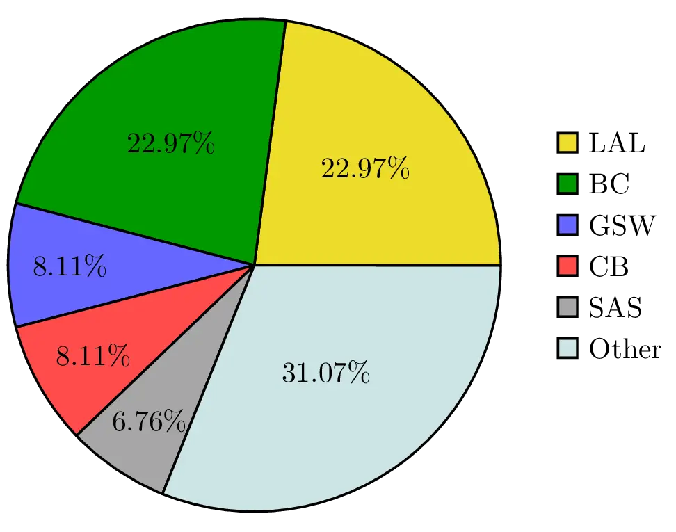
Add legend to a Pie chart in LaTeX
Plot Pie charts without transforming data to percentages
As we mentioned earlier, pgf-pie assumes that the total of our values is 100. However, in some cases, we might need to show the number of occurrences instead of percentages. In our example, we have 74 NBA championship trophy to portion out. We can show them using sum command. If we use it with auto parameter, it will automatically sum all our values and will portion each slice according to its percentage. Here is an illustrative example:
\begin{tikzpicture}

\pie[
	color = {
		yellow!90!black,
		green!60!black,
		blue!60,
		red!70,
		gray!70,
		teal!20},
	sum = auto
]{17/LAL,
	17/BC,
	6/GSW,
	6/CB,
	5/SAS,
	23/Other
}

\end{tikzpicture}
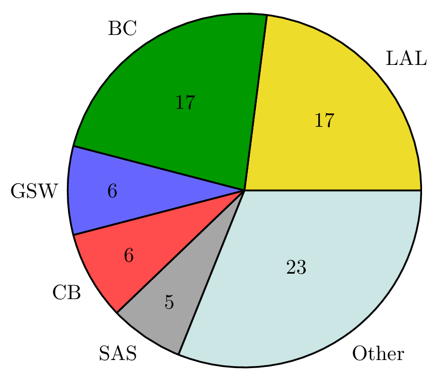
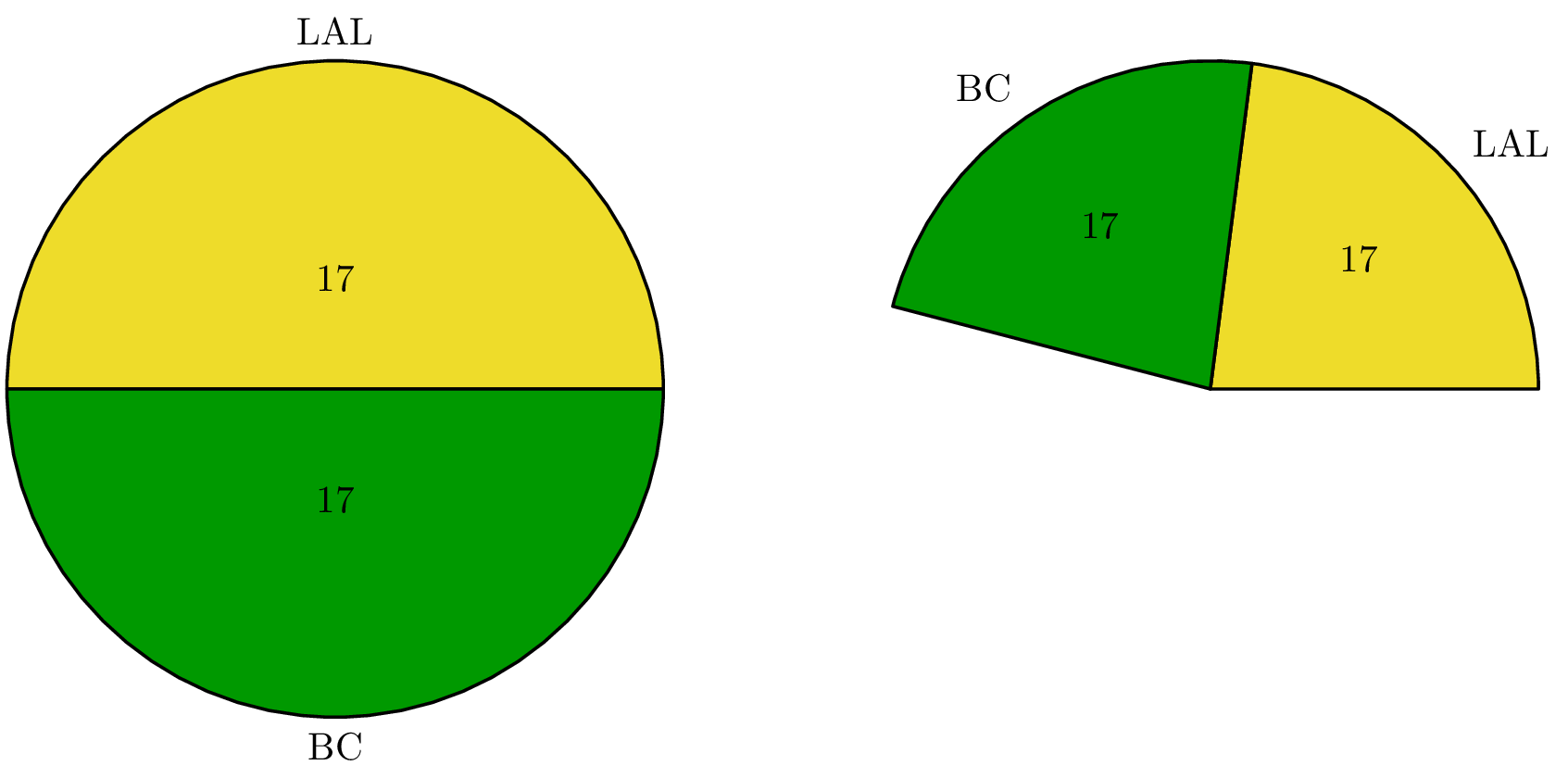
Another way to use the sum command is to give it a total number manually and let it create slices proportioned to that sum number. We can draw only one or two slices using this option. In following code snippet, we created two charts representing only the two teams with the most wins. The first chart automatically sums up the occurrences and creates a full pie, but the second one creates slices with proportion to given parameter, which is 74.
\begin{tikzpicture}

% Pie chart 1
\pie[
	color = {
		yellow!90!black,
		green!60!black
	},
	sum = auto
]{17/LAL, 17/BC}

% Pie chart 2
\pie[
	pos={8,0},
	color = {
		yellow!90!black,
		green!60!black
	},
	sum = 74
]{17/LAL, 17/BC}

\end{tikzpicture}
