Drawing a Bar Chart in TikZ
To create a drawing environment, we need to add tikzpicture environment, initiate our axis and begin drawing. It should be noted that we need to load the PGFplots package, built on the top of TikZ/PGF, to plot our charts in a linear axis.
 \documentclass{standalone}

% Bar chart drawing library
\usepackage{pgfplots}

\begin{document}

\begin{tikzpicture}
\begin{axis}
	% We will draw our bar chart here
\end{axis}
\end{tikzpicture}

\end{document}
\addplot command with xbar option
There is a command to plot our coordinates in the axis environment, named \addplot. It is really easy to turn a coordinate plot to a bar plot, we only need to add xbar to our command, which is the keyword for creating a horizontal bar chart. Here is an example:
 \documentclass[border=0.2cm]{standalone}

% Bar chart drawing library
\usepackage{pgfplots}

\begin{document}

\begin{tikzpicture}
\begin{axis}

\addplot+[xbar] coordinates {
	(1,0)
	(2,1)
	(3,2)
	(0,3)
};

\end{axis}
\end{tikzpicture}

\end{document}

Here, we only added to the \addplot command the option xbar in order to create a horizontal bar line between line y=0 and each coordinate.
It successfully did the job, but our plot has a raw look and probably needs a bit formatting to be ready for printing. There's a predefined format package we can start with, aptly named as xbar, but this time we will use it as a styling argument for our axis. Following plot shows the same plot using predefined xbar styling. Here is an example:
 \documentclass[border=0.2cm]{standalone}

% Bar chart drawing library
\usepackage{pgfplots}

\begin{document}

\begin{tikzpicture}

\begin{axis} [xbar]
\addplot coordinates {
	(1,0)
	(2,1)
	(3,2)
	(0.5,3)
};
\end{axis}

\end{tikzpicture}

\end{document}

It is already looking much like a bar chart. The dots representing our coordinates are cleared, our bars are filled and ticks for our axis labels (0, 1, 2 and 3) are aligned towards outside of the plot area, which is handy because usually the bars start right after the axis line. Now, could you predict how one plot a vertical bar chart?
Vertical Bar Chart with ybar option
Previously, we have added the xbar option and we've got a horizontal bar chart. To get a vertical one, we can simply use ybar as an option to the axis environment. Here is another example:
 \documentclass[border=0.2cm]{standalone}

% Bar chart drawing library
\usepackage{pgfplots}

\begin{document}

\begin{tikzpicture}

\begin{axis} [ybar]
\addplot coordinates {
	(1,0.5)
	(2,2.5)
	(3,2)
	(4,3)
};
\end{axis}

\end{tikzpicture}

\end{document}

How to set axis limits?
Setting axis limits can be done right away using xmin, xmax to arrange the minimum and maximum value for x axis. ymin and ymax commands work in a similar way but for y axis. Using these commands, we can declare limits for our coordinate system.
 \documentclass[border=0.2cm]{standalone}

% Bar chart drawing library
\usepackage{pgfplots}

\begin{document}

\begin{tikzpicture}

\begin{axis} [ybar,xmin=0,xmax=5,ymin=0,ymax=4]
\addplot coordinates {
	(1,0.5)
	(2,2.5)
	(3,2)
	(4,3)
};
\end{axis}

\end{tikzpicture}

\end{document}

The next step is to change the bar width in our plot.
Change bar width
Changing the bar width can be achieved by adding the option bar width=<value> to the axis options. Here is an example:
 \documentclass[border=0.2cm]{standalone}

% Bar chart drawing library
\usepackage{pgfplots}

\begin{document}

\begin{tikzpicture}

\begin{axis} [ybar,bar width=15pt]
\addplot coordinates {
	(1,0.5)
	(2,2.5)
	(3,2)
	(4,3)
};
\end{axis}

\end{tikzpicture}

\end{document}

How to change the plot size?
To set the height and width for the entire plot, we can add the options: height=<value> and width=<value>. The following code shows their effects by setting height to 6cm and width of the plot to 8 cm.
 \documentclass[border=0.2cm]{standalone}

% Bar chart drawing library
\usepackage{pgfplots}

\begin{document}

\begin{tikzpicture}

\begin{axis} [ybar,height=6cm,width=8cm]
\addplot coordinates {
	(1,0.5)
	(2,2.5)
	(3,2)
	(4,3)
};
\end{axis}

\end{tikzpicture}

\end{document}

How to plot multiple bar charts in the same figure?
Sometimes we need to represent more than one category in our chart. We can easily add another category using another \addplot command.
Our new bars will appear next to each other, but we will need to make new arrangements to have enough space for our new bars. First, we can add:
- an enlarge y limits={abs=0.8} command which will add 0.8 units to both sides of our y axis (top and bottom). However, the new space may make some of our tick labels disappear, which is definitely not wanted in a bar chart. We can force our data labels to appear by using ytick = data option. (There is also an xtick=data option.) Using ytick command after enlarging our limits overwrites its effects, so we will add it before enlarging.
- xbar=0.05cm command which changes the distance between our two bars, 0.05cm in the following example. Below we added another category and changed our plot to fit everything.
 \documentclass[border=0.2cm]{standalone}

% Bar chart drawing library
\usepackage{pgfplots}

\begin{document}

\begin{tikzpicture}

\begin{axis} [xbar = .05cm,
	bar width = 12pt,
	xmin = 0,
	xmax = 4,
	enlarge y limits = {abs = .8},
	enlarge x limits = {value = .25, upper},
]

\addplot coordinates {(1,0) (2,1) (3,2) (0,3)};
\addplot coordinates {(2,0) (1,1) (4,2) (1,3)};

\end{axis}

\end{tikzpicture}

\end{document}

Change line width, line color and fill color
Now that we have more than one category, we can turn our focus to formatting the look of the bars. Our main formatting options for addplot command are: line color, line thickness and fill color or pattern.
- We can choose to not draw an outline for our bars using draw = none, or we can select colors (such as draw = blue).
- To declare line width, we can select from predefined line thickness keywords such as thick, semithick or ultra thick. Another option to declare it using line width=<value> option.
- We can use fill command to paint inside the bars similarly to draw command. There is also an option to fill the bars with a pattern. To use it, we need to include a TikZ library called patterns (\usetikzlibrary{patterns}). The library will enable us to choose from patterns such as dots, horizontal lines, vertical lines, grid, crosshatch, etc. We can set their colors too, using pattern color option. Check this post for more details: Free body diagram of Atwood's machine in TikZ.
We showed some of these options over our two bar categories below.
 \documentclass[border=0.2cm]{standalone}

% Bar chart drawing library
\usepackage{pgfplots}
\usetikzlibrary{patterns}

\begin{document}

\begin{tikzpicture}

\begin{axis} [xbar = .05cm,
	bar width = 12pt,
	xmin = 0,
	xmax = 4,
	ytick = data,
	enlarge x limits = {value = .25, upper},
	enlarge y limits = {abs = .8}
]

\addplot [draw = red,
	line width = .4mm,
	fill = yellow
] coordinates {(1,0) (2,1) (3,2) (0,3)};

\addplot [draw = blue,
	semithick,
	pattern = dots,
	pattern color = blue
]	coordinates {(2,0) (1,1) (4,2) (1,3)};

\end{axis}

\end{tikzpicture}

\end{document}

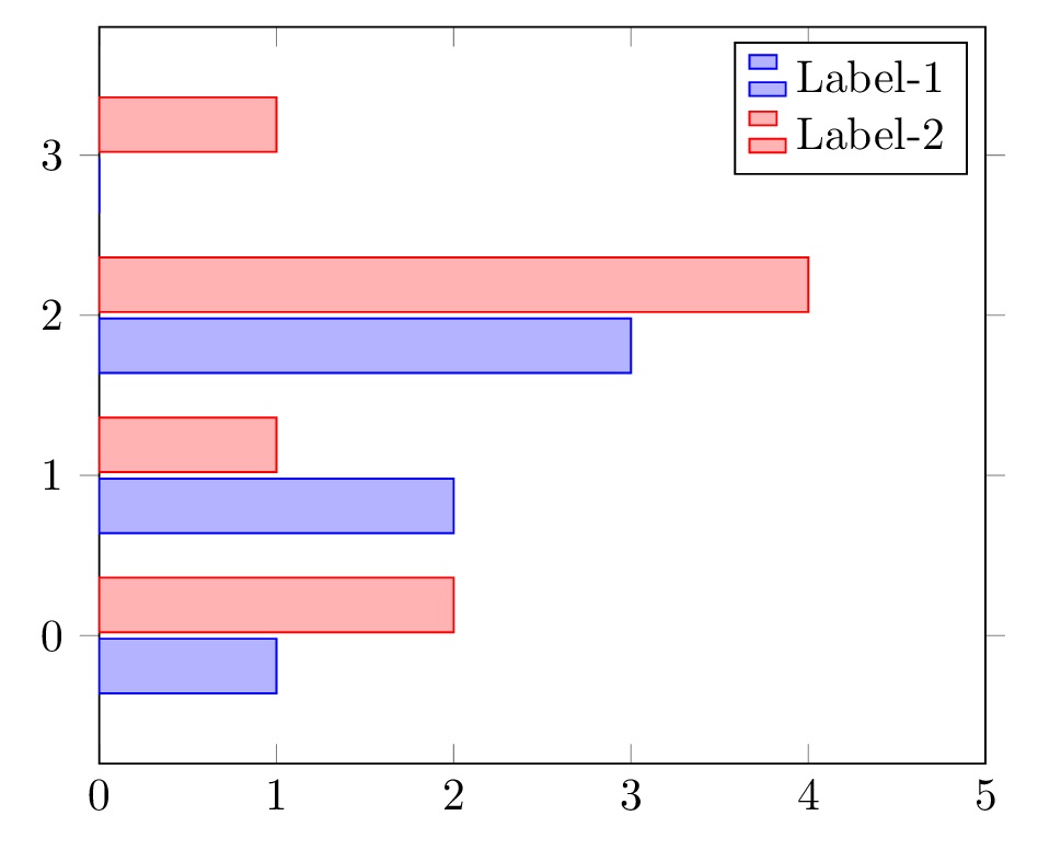
Add a legend to a bar chart in LaTeX
Now that we have more than one category, we must add a legend table to our chart. Like most of the elements in pgfplots, adding the element is quite easy and there are lots of options to tweak. We can add a legend by using \legend command in our axis. We need to add each categories' name respectively as a parameter. By default, it will add the legend table to the upper right corner of out plot.
 \documentclass[border=0.2cm]{standalone}

% Bar chart drawing library
\usepackage{pgfplots}
\usetikzlibrary{patterns}

\begin{document}

\begin{tikzpicture}

\begin{axis} [xbar = .05cm,
	bar width = 12pt,
	xmin = 0,
	xmax = 4,
	ytick = data,
	enlarge x limits = {value = .25, upper},
	enlarge y limits = {abs = .8}
]

\addplot coordinates {(1,0) (2,1) (3,2) (0,3)};
\addplot coordinates {(2,0) (1,1) (4,2) (1,3)};

\legend {Label-1, Label-2};

\end{axis}

\end{tikzpicture}

\end{document}
